

Threads
addCommentAnnotation
- Adds a new comment annotation.
- Params: AddCommentAnnotationRequest
- Returns: AddCommentAnnotationEvent
- React / Next.js
- Other Frameworks
addCommentOnSelectedText

textMode a Comment Tool button will appear. Clicking the button will add a comment on the highlighted text.
If you want to trigger the comment using an API method call instead of clicking the button, you can do the following:
- React / Next.js
- Other Frameworks
addCommentOnElement
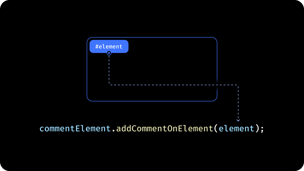
addCommentOnElement() method and pass in an object with the schema shows in the example:
Example 1: Add comment with targetElementId only:
- React / Next.js
- Other Frameworks
addManualComment
- This feature is particularly useful for complex UIs where you need precise control over the placement of Comment Pins.
- Using this you can manually set the position of Comment Annotations.
- Handle click events on your canvas/document and use the this method to create a comment with custom metadata.
- React / Next.js
- Other Frameworks
Comment and Reply Placeholders
Customize the placeholder text shown in the Comments dialog inputs to match your product voice and guide first-time users.- React / Next.js
- Other Frameworks
editPlaceholder, editCommentPlaceholder, and editReplyPlaceholder. See VeltCommentsProps for details.
deleteCommentAnnotation
- Deletes a comment annotation
- Params: DeleteCommentAnnotationRequest
- Returns: DeleteCommentAnnotationEvent
- React / Next.js
- Other Frameworks
deleteSelectedComment
To delete a comment using an API method, use thedeleteSelectedComment() method.
- React / Next.js
- Other Frameworks
getCommentAnnotationsCount
- Get the total and unread comment annotations count of all the comment annotations across specified Organization, Folder, Document and Multiple Documents levels.
- If you don’t specify any query, it will return data from the folder/documents specified in the
setDocumentsmethod. - You can also use this api without setting the document.
- Auto-batching: When 2+
documentIdsare provided, requests are automatically batched to reduce persistence listeners. UsedebounceMsto control batching delay (default: 5000ms). - Params: (optional) CommentRequestQuery
- Set
aggregateDocumentstotrueto aggregate comment counts across all documents set in thesetDocumentsmethod, returning a single combined count instead of per-document counts. - Set
batchedPerDocumenttotrueif you want to display comment count for a large number of documents (e.g., 100 documents) on the same page. This is now automatically enabled when 2+documentIdsare provided. - Refer to CommentRequestQuery for more parameters you can use.
- Set
- Returns: GetCommentAnnotationsCountResponse
- React / Next.js
- Other Frameworks
getUnreadCommentAnnotationCountByLocationId
- Get the number of
CommentAnnotationswith at least 1 unread Comment by Location Id.
- React / Next.js
- Other Frameworks
Using Hooks:Using API:To unsubscribe from the subscription:
getCommentAnnotations
- Subscribe to the comment annotations for all the specified documents.
- If you don’t specify any query, it will return data from the currently set
documentsandlocations. - You can specify 30 documents at a time.
- Params: (optional) CommentRequestQuery
- Returns: GetCommentAnnotationsResponse
Available on SDK version 4.0.0 and above.
- React / Next.js
- Other Frameworks
Using Hooks:Using API:
fetchCommentAnnotations
- Fetches comment annotations based on various criteria such as organizationId, folderId, or specific documentIds.
- It supports pagination and filtering options.
- This is different from the existing subscription API which susbcribes to realtime changes to the comments data.
- Params: FetchCommentAnnotationsRequest
- Returns: FetchCommentAnnotationsResponse
- React / Next.js
- Other Frameworks
getSelectedComments
- Get the currently selected comment annotations.
- Returns:
CommentAnnotation[].
- React / Next.js
- Other Frameworks
getCommentAnnotationById
- Retrieve a specific comment annotation by its ID.
- By default, it will return the comment annotation for the current
documentId. - If you pass in a
documentId, it will return the comment annotation for the givendocumentId. - Returns: CommentAnnotation
- React / Next.js
- Other Frameworks
Using Hooks:Using API:To unsubscribe from the subscription:
getElementRefByAnnotationId
This will return the Xpath of the DOM element on which the comment was added.- React / Next.js
- Other Frameworks
submitComment
Programmatically submit a comment from a composer. Enables custom buttons or keyboard shortcuts for submitting comments. The composer must have atargetComposerElementId set for this method to work.
- Params:
SubmitCommentRequest - Returns:
void - See also: Comment Composer targetComposerElementId
- React / Next.js
- Other Frameworks
clearComposer
Reset composer state including text, attachments, recordings, tagged users, assignments, and custom lists.- Params:
ClearComposerRequest - Returns:
void
- React / Next.js
- Other Frameworks
getComposerData
Fetch current composer state on-demand. Returns same data structure as composerTextChange event.- Params:
GetComposerDataRequest - Returns:
ComposerTextChangeEvent
- React / Next.js
- Other Frameworks
markAsRead
- Mark a comment annotation as read for the current user. This updates the
viewedByfield of the comment annotation to include the current user. - Params:
annotationId: string - Returns:
Promise<void>
- React / Next.js
- Other Frameworks
markAsUnread
- Mark a comment annotation as unread for the current user. This removes the current user from the
viewedByfield of the comment annotation. - Params:
annotationId: string - Returns:
Promise<void>
- React / Next.js
- Other Frameworks
Messages
addComment
- Add a comment to a specific comment annotation
- Params: AddCommentRequest
- Returns: AddCommentEvent
- React / Next.js
- Other Frameworks
updateComment
- Update a comment in a specific comment annotation
- Params: UpdateCommentRequest
- Returns: UpdateCommentEvent
- React / Next.js
- Other Frameworks
deleteComment
- Delete a comment from a specific comment annotation
- Params: DeleteCommentRequest
- Returns: DeleteCommentEvent
- React / Next.js
- Other Frameworks
getComment
- Get comments from a specific comment annotation
- Params: GetCommentRequest
- Returns: Comment[]
- React / Next.js
- Other Frameworks
getUnreadCommentCountOnCurrentDocument
- React / Next.js with Hooks
- React / Next.js
- Other Frameworks
You can get the number of unread
Comments on the current Document by using the useUnreadCommentCountOnCurrentDocument() hook:getUnreadCommentCountByLocationId
- React / Next.js with Hooks
- React / Next.js
- React / HTML
You can get the number of unread
Comments by Location Id by using the useUnreadCommentCountByLocationId() hook:getUnreadCommentCountByAnnotationId
- React / Next.js with Hooks
- React / Next.js
- Other Frameworks
You can get the number of unread
Comments by annotation id by using the useUnreadCommentCountByAnnotationId() hook:@Mentions
assignUser
- Assigns a user to a comment annotation
- Params: AssignUserRequest
- Returns: AssignUserEvent
- React / Next.js
- Other Frameworks
setAssignToType
Configure the assign-to UI mode as dropdown or checkbox. API Method:setAssignToType()
- Params:
AssignToConfig - Returns:
void
- React / Next.js
- Other Frameworks
customAutocompleteSearch
- Handle autocomplete search for @mentions. You should use this if you have a large contact list that you want to plug into the autocomplete dropdown, and search directly your own data source.
- Event:
AutocompleteSearchEvent
- React / Next.js
- Other Frameworks
1
Enable the feature
2
Set initial list
3
Handle search event
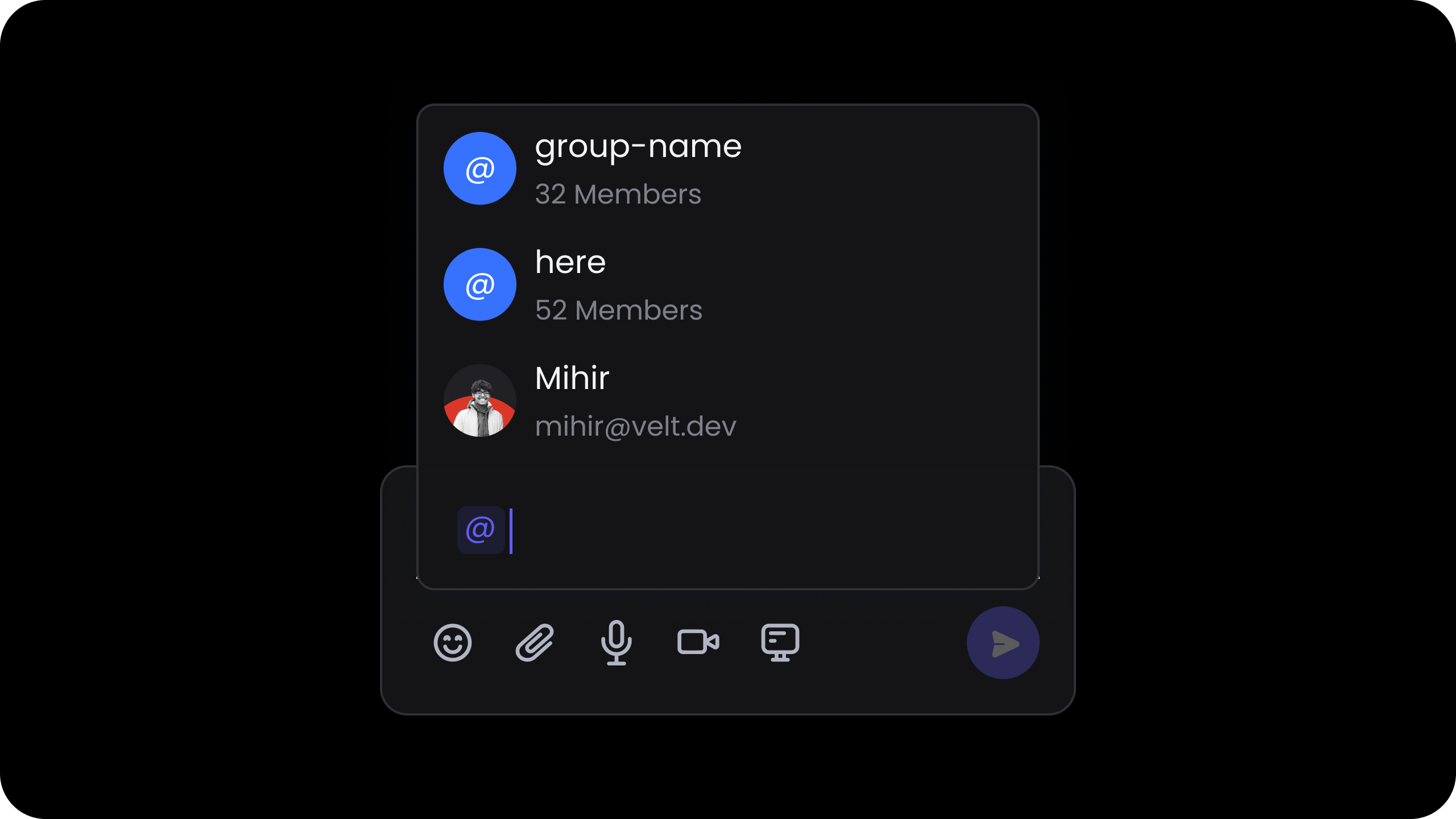
enableAtHere
- This allows you to notify all the users explicitly added to the current document.
- It won’t notify users in the organization who are not explicitly added to the document.
- React / Next.js
- Other Frameworks
Hooks:API:
enableUserMentions
- This allows you to enable or disable user @mentions.
Default: true
- React / Next.js
- Other Frameworks
Using Props:Using Hooks:Using API Method:
enablePaginatedContactList
- Limits users downloaded for customers with thousands of users.
- Performance optimization that reduces initial download.
Default: false
- React / Next.js
- Other Frameworks
Using Props:Using API Method:
anonymousEmail
- Controls whether unrecognized email addresses (not in the contact list) are resolved in the @mention flow.
- When disabled:
- Freeform email addresses entered in the composer are ignored: they won’t show up in @mention suggestions, won’t be added to
taggedUserContacts, and won’t be converted to contacts. However, known contacts (users matched from your contact list by email) will always appear, no matter this setting. - Notifications will not be sent to anonymous (unrecognized) email addresses.
- Freeform email addresses entered in the composer are ignored: they won’t show up in @mention suggestions, won’t be added to
Default: true
- React / Next.js
- Other Frameworks
Using Props:Using API Method:
expandMentionGroups
- Expand the user groups and show individual users inside the groups in the @mentions dropdown menu.
- React / Next.js
- Other Frameworks
Mention Span CSS Classes
- When a user selects an @mention from the autocomplete dropdown, the inserted
<span>element receives CSS classes that indicate the mention type. velt-mentionis always present on every mention span.velt-mention--nameis added when the mention is a user name.velt-mention--emailis added when the mention is an email address.
getContactList
- Subscribe to the list of users added to organization, folder, document, user groups or the ones overwritten using the
updateContactListAPI. - Params: none
- Returns: GetContactListResponse
- React / Next.js
- Other Frameworks
Using Hooks:Using API:
onContactSelected
- This event is triggered when a contact is selected from the contact dropdown in the Comment Dialog.
- Use the event object to determine if the selected contact has access to the document using fields like
isOrganizationContact,isDocumentContactanddocumentAccessType. - If the selected contact doesn’t have access to the document, you can show an invite dialog to the user to invite the contact to the document.
- React / Next.js
- Other Frameworks
Using Hooks:Using API:
setAtHereLabel
- This allows you to modify the default text of the @here feature. eg: @all, @everyone, @team, etc.
- React / Next.js
- Other Frameworks
Using Props:Using Hooks:Using API Method:
setAtHereDescription
- Customize the description that appears for the @here mention.
- React / Next.js
- Other Frameworks
Using Props:Using Hooks:Using API Method:
showMentionGroupsFirst
- Show the user groups in the @mentions dropdown menu before the non-group users.
- React / Next.js
- Other Frameworks
showMentionGroupsOnly
- Show only the user groups in the @mentions dropdown menu and not the non-group users.
- React / Next.js
- Other Frameworks
subscribeCommentAnnotation
- Subscribes to a comment annotation
- Params: SubscribeCommentAnnotationRequest
- Returns: SubscribeCommentAnnotationEvent
- React / Next.js
- Other Frameworks
unsubscribeCommentAnnotation
- Unsubscribes from a comment annotation
- Params: UnsubscribeCommentAnnotationRequest
- Returns: UnsubscribeCommentAnnotationEvent
- React / Next.js
- Other Frameworks
updateContactList
- By default, the contact list is generated using the users in the organization and the document.
- However, if you do not want to use that feature or want to provide a custom list of contacts, you can use this method.
- By default, it will overwrite the current contact list. You can merge the provided contacts with the existing list by passing the merge flag as
{merge:true}. - When
filters: trueis passed, the sidebar People, Assigned, Tagged, and Involved filters are restricted to the custom contact list plus the current user. - This method will only update the contact list in the current user session. It doesn’t update the user contacts in the database or change the access control.
- React / Next.js
- Other Frameworks
Using Hooks:Using API:Restrict sidebar filters to the contact list:
updateOrgList
- Supplies the list of teams shown in the comment dialog’s “Selected Teams” visibility picker.
- Takes an
UpdateOrgListConfigwhoseorgListis an array ofOrgContact({ id, name? }). - Unlike
updateContactList, this is a full replace on every call (it does not merge). Pass{ orgList: [] }to clear the picker and revert the banner option to “Your Team”. - Exposed on
contactElementonly.
- React / Next.js
- Other Frameworks
updateContactListScopeForOrganizationUsers
- Sometimes you may want to show only certain types of contacts in the contact dropdown.
- By default, organization users will see all contacts in the organization, any user groups and any contacts added to the document.
- Using this method, you can restrict the contacts shown in the dropdown to only certain types.
- This only affects the Organization Users and not the Document Users. Document Users will always only see contacts added to the document.
all: Show all the contactsorganization: Show organization contacts.organizationUserGroup: Show organization user groups.document: Show document contacts.
- React / Next.js
- Other Frameworks
setAnonymousUserDataProvider
Register a provider to resolve email →userId mappings for users who are tagged by email in comments but are not part of the contact list. When a comment is saved and a tagged contact or to recipient has an email but no userId, the SDK calls the provider to look up the userId and backfills it into the comment data before persisting.
Full implementation guide →
autoCompleteScrollConfig
Customize virtual scroll behavior in autocomplete dropdown for @mentions. Type:AutoCompleteScrollConfig
- React / Next.js
- Other Frameworks
Metadata
addContext
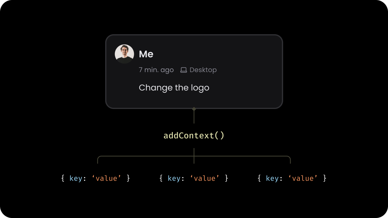
Custom metadata allows you to add extra information to comments, enhancing their functionality. Here’s what you can do with it:- Render additional data on comments
- Position comment pins manually
- Create custom UI components
- Enable comment filtering on custom data
addContext method. This method accepts an object with key-value pairs.
addCommentAnnotationDraftaddCommentAnnotation
context as a prop to most components that helps with creating new comment annotations. Eg:
VeltCommentToolVeltCommentComposerVeltCommentDialogComposerVeltInlineCommentsSection
- React / Next.js
- Other Frameworks
updateContext
- Update the custom metadata associated with a comment annotation using the
updateContextmethod. - Utilize this method to update the context of a comment annotation at any time. For example, you might use this when the name of the dashboard containing the comment annotation changes.
commentElement.updateContext() method accepts three parameters:
- The Comment Annotation ID
- The new metadata object
- An optional
updateContextConfigobject. Specify how the new metadata should be applied:{ merge: true }: Merges the new metadata with the existing metadata{ merge: false }or omitted: Replaces the existing metadata entirely (default behavior)
- React / Next.js
- Other Frameworks
Using API:
setContextProvider
Provide custom context (metadata) dynamically for comments using a provider function. This method allows you to return context based on the document and location where a comment is being added. The SDK will call this function whenever a new comment annotation is created so you can provide dynamic values for the context. The provider function receivesdocumentId and optional location parameters and can return a CommentContext object, null, undefined, or a Promise resolving to any of these values.
- React / Next.js
- Other Frameworks
setContextInPageModeComposer
Set context data for the page mode composer programmatically. Accepts aPageModeComposerConfig object. Pass custom context data that will be included when a comment is created through the page mode composer.
API Method: setContextInPageModeComposer()
For automatic context passing when opening the comment sidebar via the comment
tool, see contextInPageModeComposer.
- React / Next.js
- Other Frameworks
clearPageModeComposerContext
Clear context data from page mode composer. This is useful when you are using sidebar in embed mode and have to clear the context from page mode composer manually. API Method:clearPageModeComposerContext()
- Params: none
- Returns:
void
- React / Next.js
- Other Frameworks
Aggregation
Overview
Aggregation lets you filter, group, and render comments that match specific criteria — without writing any custom logic.It’s especially powerful when comments are tied to structured data such as products, categories, or financial entities. You can group comments by:
- Metadata (
context) - Element IDs (
targetElementId) - Resource identifiers (
documentId,folderId,locationId)
When to Use Aggregation
Use aggregation when your app involves complex relationships or taxonomy-based filtering.🧩 Tables & Dashboards
Supply Chain ExampleA product can belong to multiple categories. When viewing data by category, you may want to display all comments made on products within that category — or even across product variants. Financial Planning Example
A budget item (e.g., Marketing Q1) can have multiple subcategories (e.g., Paid Ads, Sponsorships).
Aggregation allows you to show all comments related to a specific period, department, or account group — even if those comments live across different documents or views.
How It Works
Comment Metadata Fields
Each comment can include one or more of the following identifiers or metadata fields:Comment Creation
When you use any of the above identifiers or metadata fields in the following supported components, they automatically get attached to the comment at the time it’s created.This ensures that each comment carries the correct folder, document, element, or context metadata — so it can later be filtered or grouped accurately. Supported Components
- Inline Comments Section
- Comment Tool
- React / Next.js
- Other Frameworks
Comment Rendering
When the above identifiers or metadata fields are passed to the following rendering components, they determine which comments are displayed. Only comments that match the provided folder, document, element, or context values will be rendered in that component. Supported Components- Comment Bubble
- Inline Comments Section
- Comment Pin (Standalone) — does not support
targetElementId
- React / Next.js
- Other Frameworks
Filtering Behavior
When filtering comments, only annotations matching all provided fields will be shown:Context Matching
You can choose between two matching modes for the context field: Full Match (default) or Partial Match.
🔒 Full Match (Default)
A comment matches only if all fields in its context exactly match your filter criteria. Example:- React / Next.js
- Other Frameworks
🔍 Partial Match
Enable partial matching withcontextOptions={{ partialMatch: true }}.
A comment matches if all fields in your filter exist in the comment’s context.Extra fields in the comment context don’t prevent a match. Example:
- React / Next.js
- Other Frameworks
Grouping Matched Comment Annotations
When multiple comments match your filter criteria, you can group them into a single visual element — such as a Comment Bubble, Comment Pin, or Inline Comments Section — for a cleaner, multi-threaded UI. How it works:- Enable grouping globally with
groupMatchedComments - All matching annotations are shown as one grouped thread
- The comment count shows total grouped annotations
- Users can expand to view and interact with all related threads
"product: cheese" across different months, they can all appear in one Comment Bubble when you filter by { product: "cheese" }.
- React / Next.js
- Other Frameworks
Private Comments (beta)
The visibility system uses two separate sets of values:
- API methods (on this page) use
CommentVisibilityConfigwith 3 values:'public','organizationPrivate','restricted'. - UI wireframes use the
CommentVisibilityOptionenum with 4 values:'restrictedSelf','restrictedSelectedPeople','organizationPrivate','public'.
'restricted' value covers both “self-only” and “selected people” — distinguished by whether userIds is provided.updateVisibility
Manage who can view a comment annotation by updating its visibility settings. Use this method to control whether a comment is public, restricted to your organization, or visible only to specific users. The resulting setting is stored on the annotation asvisibilityConfig.
- To use this feature, you need to first enable it in Velt Console
- Params: CommentVisibilityConfig
type:'public': Comment visible to all users'organizationPrivate': Comment visible only to users in the specified organization. Even if someone is added to the document but not to the organization, they will not be able to view the comment.'restricted': Comment visible only to the specified users; the current user is always included
organizationId: string; used whentypeisorganizationPrivateorganizationIds: string[]; optional whentypeis'organizationPrivate'— target multiple orgs; merged + de-duplicated withorganizationId. With neither provided, the comment defaults to the logged-in user’s own org.userIds: string[]; optional whentypeis'restricted'— current user is always appended
- Returns:
void
When
type is 'restricted', the SDK automatically appends the current user’s userId to userIds if it is not already present. This applies whether userIds is empty or contains an explicit list that excludes the author.- React / Next.js
- Other Frameworks
enablePrivateMode
Set the default visibility for all new comments created by the current user.- Params: PrivateModeConfig
type:'restricted': New comments visible only to the specified users; the current user is always included'organizationPrivate': New comments visible only to users in the current organization
organizationId: string; optional whentypeis'organizationPrivate'organizationIds: string[]; optional whentypeis'organizationPrivate'— target multiple orgs; merged + de-duplicated withorganizationId. With neither provided, comments default to the logged-in user’s own org.userIds: string[]; optional whentypeis'restricted'— current user is always appended
- Returns:
void
When
type is 'restricted', the SDK automatically appends the current user’s userId to userIds if it is not already present. This applies whether userIds is empty or contains an explicit list that excludes the author.- React / Next.js
- Other Frameworks
disablePrivateMode
Revert new comment visibility to default public visibility.- Returns:
void
- React / Next.js
- Other Frameworks
visibilityOptions
Show a visibility banner on the comment composer that lets users set a comment’s visibility topublic, organization-private, restricted-self, or restricted before submitting. Users can also change visibility after submission from the thread options menu.
Default: false
- React / Next.js
- Other Frameworks
Using Props:Using API:
visibilityOptionClicked
Subscribe to this event to be notified when a user selects a visibility option. Emits aVisibilityOptionClickedEvent.
Setting visibility at comment creation time
If you are creating comments using API, then pass aCommentVisibilityConfig as the optional visibility field on AddCommentRequest to pre-set visibility when programmatically adding a comment.
- React / Next.js
- Other Frameworks
Using Hooks:Using API:
Custom Lists
createCustomListDataOnAnnotation
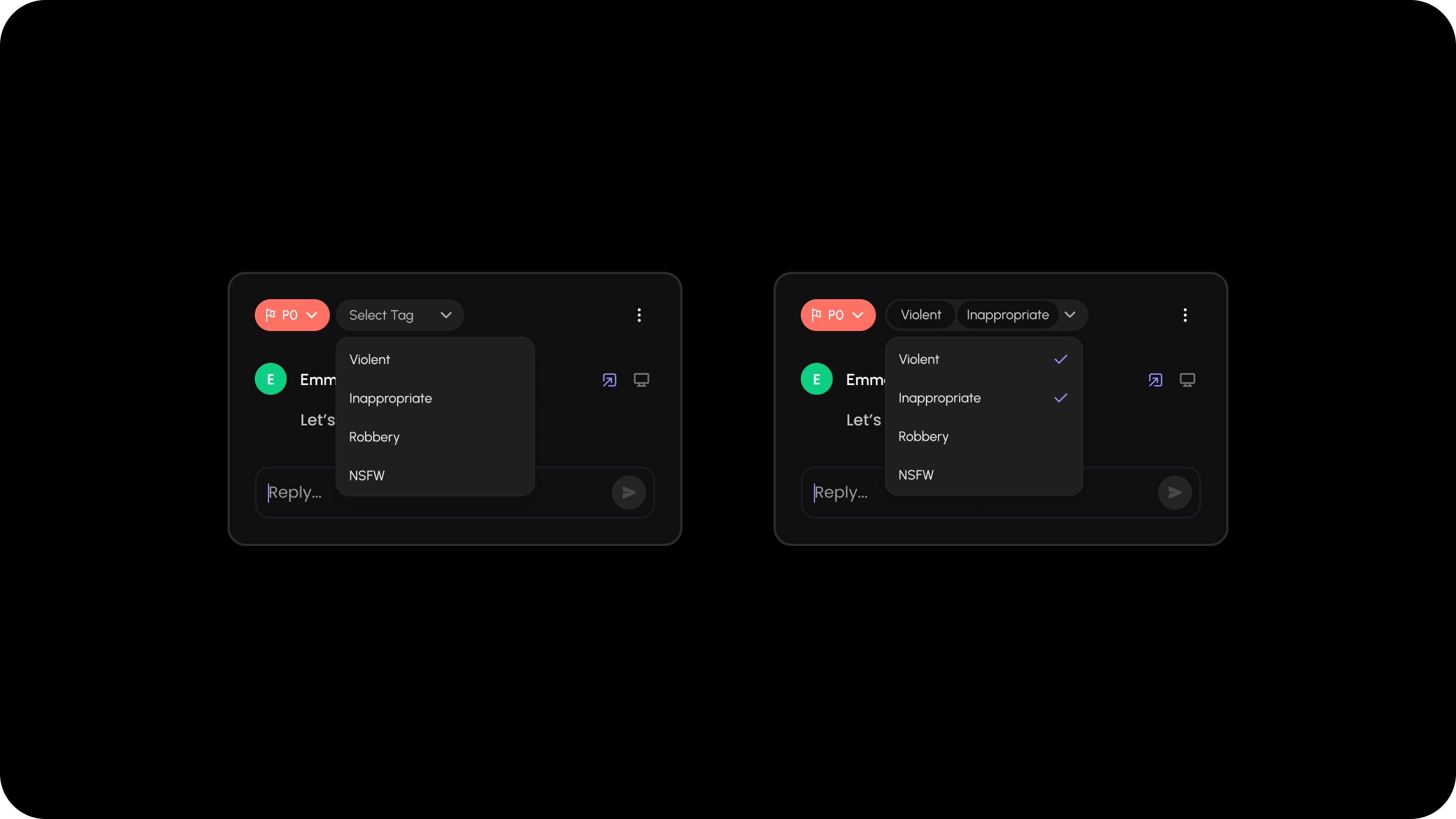
- Add a custom dropdown list at the Comment Annotation level.
- Use this to add custom tags or categories to the comment.
- React / Next.js with hooks
- React / Next.js
- Other Frameworks
Using Props:API Method:
createCustomListDataOnComment
You can have custom dropdown lists appear when certainhotkeys are pressed.
When you press a hotkey inside the Comment Dialog composer, it will open a dropdown list of items that you can select.
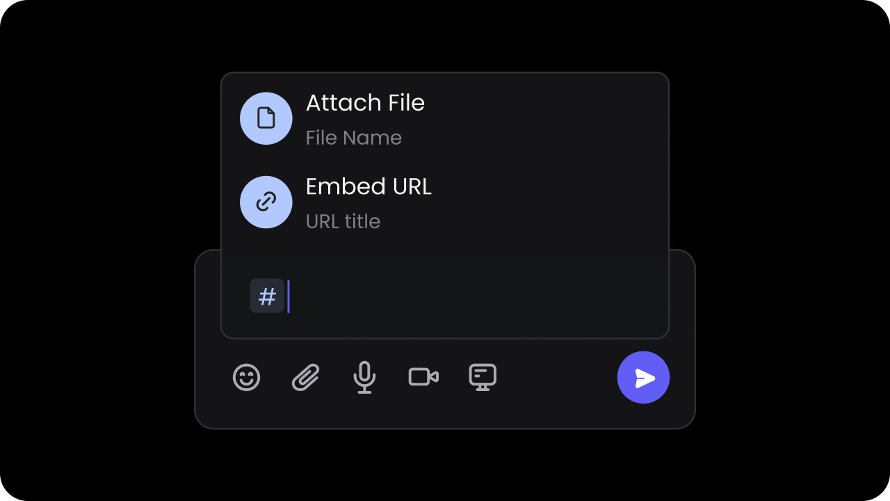
Use
AutocompleteGroup only for grouped lists. For flat lists, do not include
groups on the config object or groupId on items.Flat List Implementation
- React / Next.js with Hooks
- React / Next.js
- Other Frameworks
Grouped List Implementation
- React / Next.js with Hooks
- React / Next.js
- Other Frameworks
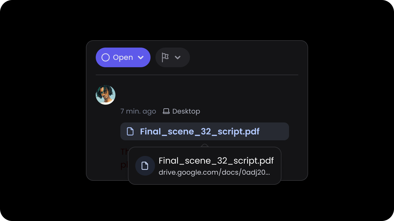
Listen to click events on chips
After the comment is saved, the item will be rendered as a chip on the comment content. When the user clicks on it, you will get an event callback with the data of the clicked chip (AutocompleteItem).
This event will also be triggered when the user clicks on the contact chips
added via the @mentions feature.
- React / Next.js with Hooks
- React / Next.js
- Other Frameworks
customAutocompleteSearch
- Handle autocomplete search for custom list. You should use this if you have a large list that you want to plug into the autocomplete dropdown, and search directly your own data source.
- Event:
AutocompleteSearchEvent
- React / Next.js
- Other Frameworks
1
Enable the feature
2
Set initial list
3
Handle search event
Event Subscription
on
Subscribe to Comment Events. Here is the list of events you can subscribe to and the event objects you will receive.- React / Next.js
- Other Frameworks
Attachments
enableAttachments
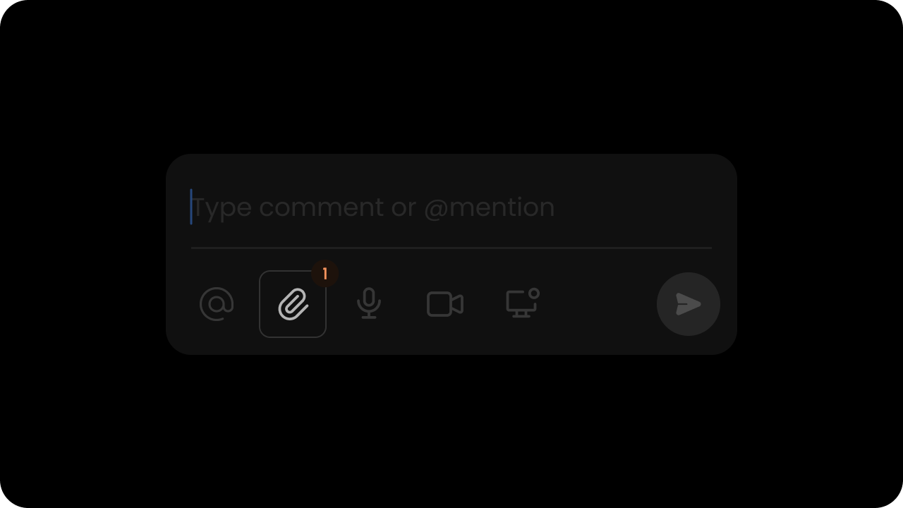
true
When this is on, users can attach image files to their comments. Users can download or delete an attachment. Users can attach multiple files at once.
Currently we support .png, .jpg, .gif (static & animated), .svg file types up to 15MB per file.
- React / Next.js
- Other Frameworks
enableAttachmentDownload
Controls whether clicking an attachment triggers a file download. Default:true
When disabled, users can still click attachments but no download is triggered. The attachmentDownloadClicked event fires on every attachment click regardless of this setting.
- React / Next.js
- Other Frameworks
enableScreenshot
Whether screenshot option is enabled in comments. Default:false
When enabled, users can attach screenshots when adding comments. This provides a quick way to capture and share visual context.
- React / Next.js
- Other Frameworks
addAttachment
- Add an attachment to a specific comment annotation
- Params: AddAttachmentRequest
- Returns: Promise<AddAttachmentResponse[]>
- React / Next.js
- Other Frameworks
deleteAttachment
- Delete an attachment from a specific comment annotation
- Params: DeleteAttachmentRequest
- Returns: Promise<DeleteAttachmentEvent | null>
- React / Next.js
- Other Frameworks
getAttachment
- Get attachments from a specific comment annotation
- Params: GetAttachmentRequest
- Returns: Promise<Attachment[]>
- React / Next.js
- Other Frameworks
allowedFileTypes
Limit file types in comment attachments by specifying allowed file extensions. Default: Not specified (all supported file types allowed) When this property is set, users can only attach files with the specified extensions. This helps you maintain security standards and ensure only approved file types are shared in collaborative discussions. By default, Velt supports.png, .jpg, .gif (static & animated), .svg file types up to 15MB per file. With allowedFileTypes, you can restrict to a subset of these or any other file extensions your application requires.
- React / Next.js
- Other Frameworks
attachmentNameInMessage
Display the attachment filename in the message when a file is attached. Default:false
When this property is enabled, the attachment filename will appear in the message text when a user selects a file to attach. This provides immediate visual confirmation of which file they’ve attached to their comment, improving clarity before submitting.
- React / Next.js
- Other Frameworks
setComposerFileAttachments
Programmatically add file attachments to the comment composer from your application instead of requiring users to select files from the file system. This method enables workflows where you want to attach files programmatically, such as:- Attaching screenshots captured within your application
- Including generated reports or documents
- Adding files from your own storage system
- Pre-populating attachments based on user context
UploadFileData object accepts the following properties:
files(required): Array of File objects to attach to the comment composerannotationId(optional): ID of the target comment annotation. Use this to add attachments to an existing comment threadtargetElementId(optional): ID of the target element where the comment composer is attached. Use this to add attachments to a specific element
- React / Next.js
- Other Frameworks
attachmentDownload
Control whether attachment downloads happen automatically when users click the download button. Default:true
When enabled, clicking the download button on an attachment will automatically download the file. When disabled, the automatic download is prevented, and you can handle the download action with custom logic by subscribing to the attachmentDownloadClicked event.
This is useful for:
- Tracking download analytics before initiating the download
- Implementing custom download URLs or CDN routes
- Adding access control checks before allowing downloads
- React / Next.js
- Other Frameworks
Text Formatting
enableFormatOptions
Enable rich text formatting toolbar in comment composers. Users can apply bold, italic, underline, and strikethrough formatting. Default:false
- React / Next.js
- Other Frameworks
setFormatConfig
Configure which format types are available in the formatting toolbar. Params:FormatConfig
- React / Next.js
- Other Frameworks
Reactions
enableReactions
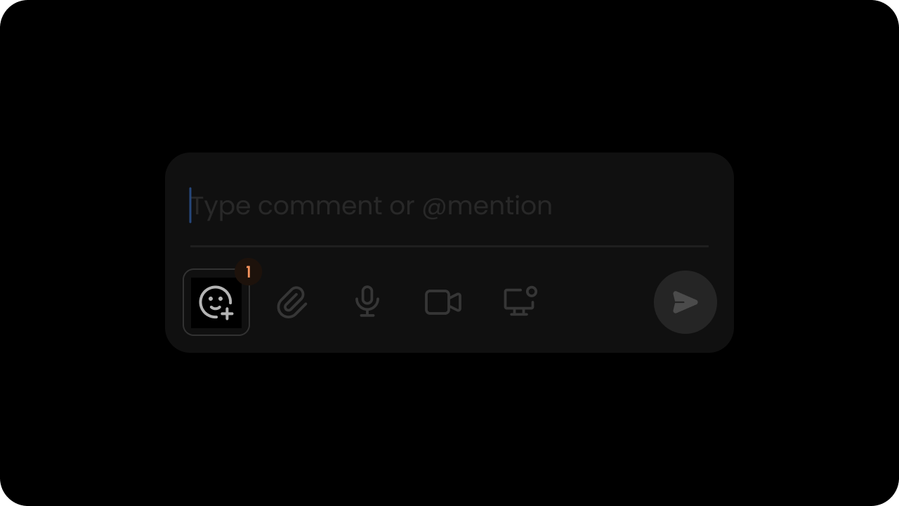
true
- React / Next.js
- Other Frameworks
setCustomReactions
- You can set custom reactions by passing a map that contains information about the reactions you want to add.
- The map keys should be the reaction ID, and the map value should contain an object with either an
urloremojifield to represent the reaction icon you want to use.
- React / Next.js
- Other Frameworks
addReaction
- Add a reaction to a specific comment annotation
- Params: AddReactionRequest
- Returns: Promise<AddReactionEvent | null>
- React / Next.js
- Other Frameworks
deleteReaction
- Delete a reaction from a specific comment annotation
- Params: DeleteReactionRequest
- Returns: Promise<DeleteReactionEvent | null>
- React / Next.js
- Other Frameworks
toggleReaction
- Toggle a reaction for a specific comment annotation
- Params: ToggleReactionRequest
- Returns: Promise<ToggleReactionEvent | null>
- React / Next.js
- Other Frameworks
Status & Priority
enableStatus
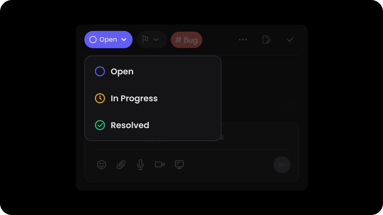
Default: true
When this is on, users can assign a status to each comment & filter comment by status in the sidebar. You can customize the list of status options as shown below on this page.
- React / Next.js
- Other Frameworks
- React / Next.js
- Other Frameworks
setCustomStatus
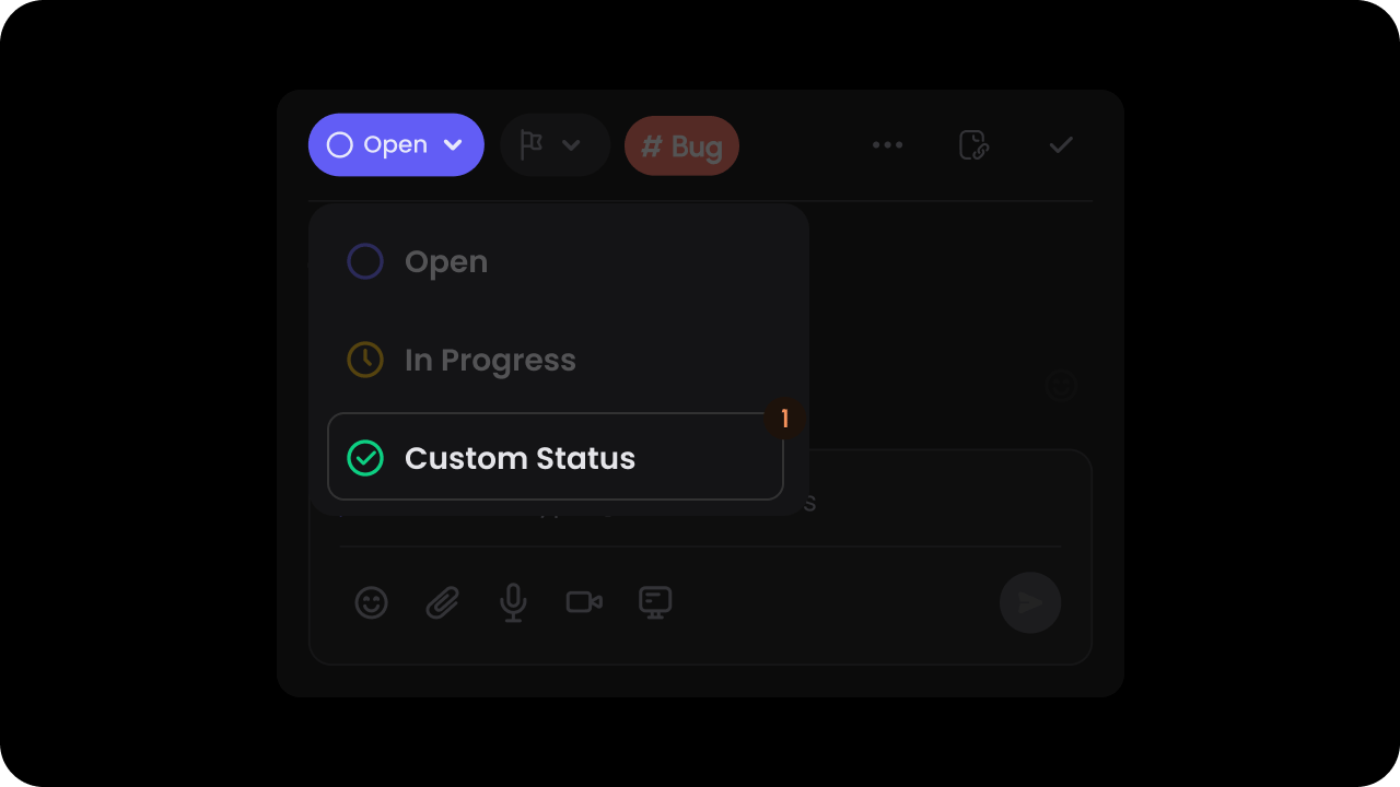
- With custom statuses, you can replace the default statuses with your own values.
- These statuses are also used in the comment sidebar to filter comments by status.
- There are three types of statuses:
default: This will be the default status assigned to each comment.ongoing: This is treated as an intermediary status, you can add as many statuses with type ongoing as you want.terminal: This represents a status that is completed. Comments with this status type are no longer shown in the DOM.
- Ensure that there are at least 2 statuses set.
- React / Next.js
- Other Frameworks
enableResolveButton
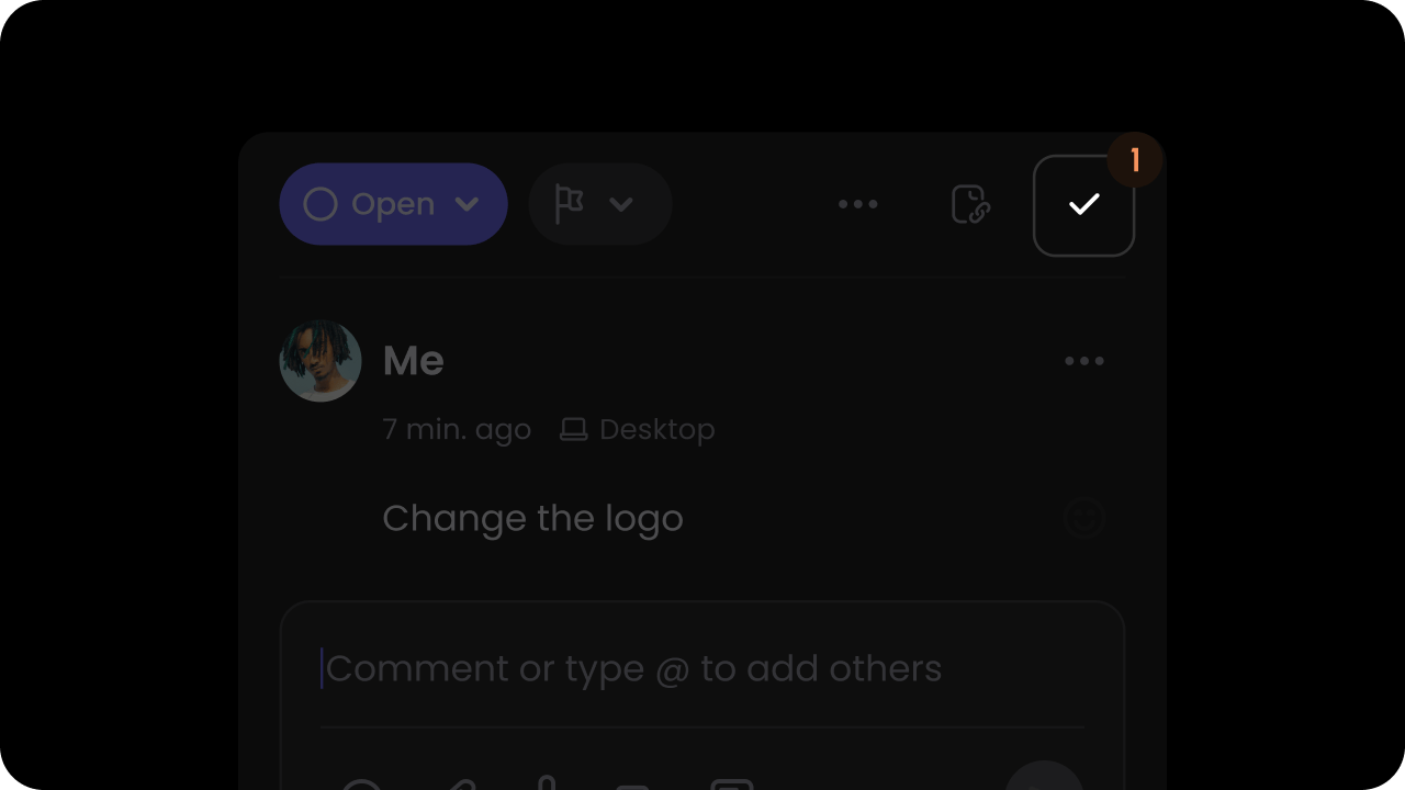
Default: true
This adds a tick mark button on the top right corner of the comment dialog. Clicking on this button will mark the comment as resolved.
- React / Next.js
- Other Frameworks
- React / Next.js
- Other Frameworks
updateStatus
- Updates the status of a comment annotation.
- Params: UpdateStatusRequest
- Returns: UpdateStatusEvent
- React / Next.js
- Other Frameworks
resolveCommentAnnotation
- Resolves a comment annotation
- Params: ResolveCommentAnnotationRequest
- Returns: ResolveCommentAnnotationEvent
- React / Next.js
- Other Frameworks
enablePriority
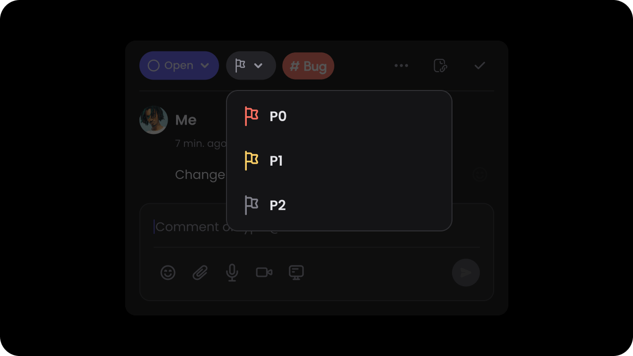
Default: false
When this is on, users can assign a priority to each comment & filter comment by priority in the sidebar. You can customize the list of priority options as shown later on this page in the Set Custom Priorities section.
- React / Next.js
- Other Frameworks
- React / Next.js
- Other Frameworks
setCustomPriority
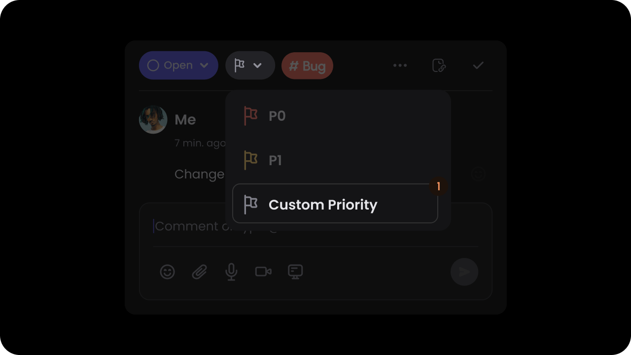
- React / Next.js
- Other Frameworks
Pass custom priorities in the
customPriority prop.Default priorities: P0, P1, P2With custom priorities, you can replace the default priorities with your own values. These priorities are also used in the comment sidebar to filter comments by priority.This will work if you have enabled the priority feature.The color property is used to set the priority pill background color.The lightColor property sets the background color of the filter.- React / Next.js
- Other Frameworks
updatePriority
- Updates the priority of a comment annotation
- Params: UpdatePriorityRequest
- Returns: UpdatePriorityEvent
- React / Next.js
- Other Frameworks
Recording
deleteRecording
- Delete a recording from a specific comment annotation
- Params: DeleteRecordingRequest
- Returns: Promise<DeleteRecordingEvent | null>
- React / Next.js
- Other Frameworks
getRecording
- Get recordings from a specific comment annotation
- Params: GetRecordingRequest
- Returns: Promise<RecordedData[]>
- React / Next.js
- Other Frameworks
setAllowedRecordings
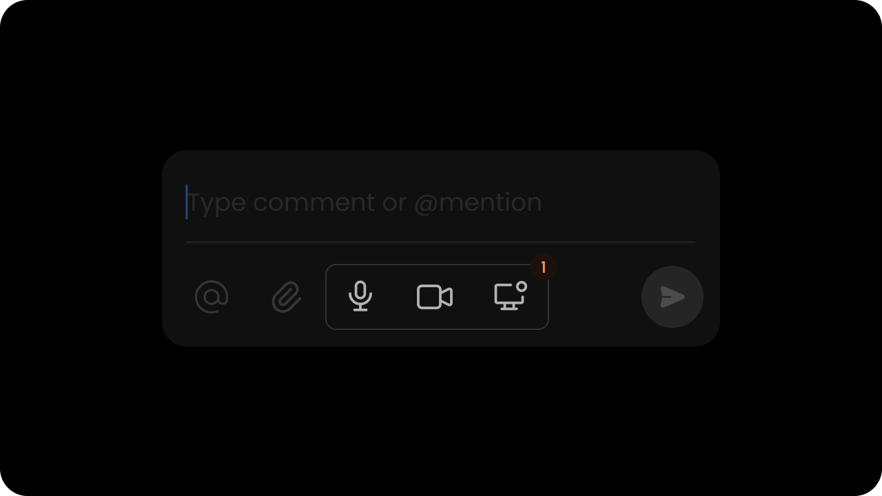
audio, screen, video, all).
audio: enables audio recordingscreen: enables screen recordingvideo: enables video recordingall: enables all recording optionsnone: disables all recording options
"audio"
- React / Next.js
- Other Frameworks
enableRecordingCountdown

true
- React / Next.js
- Other Frameworks
enableRecordingTranscription
Controls whether to enable AI transcription for recordings. Default:enabled
- React / Next.js
- Other Frameworks
Using Props:Using API Methods:
Deep Link
getLink
- Get a link to a specific comment annotation
- Params: GetLinkRequest
- Returns: GetLinkResponse
- React / Next.js
- Other Frameworks
copyLink
- Copy a link to a specific comment annotation to clipboard
- Params: CopyLinkRequest
- Returns: CopyLinkEvent
- React / Next.js
- Other Frameworks
Navigation
scrollToCommentByAnnotationId
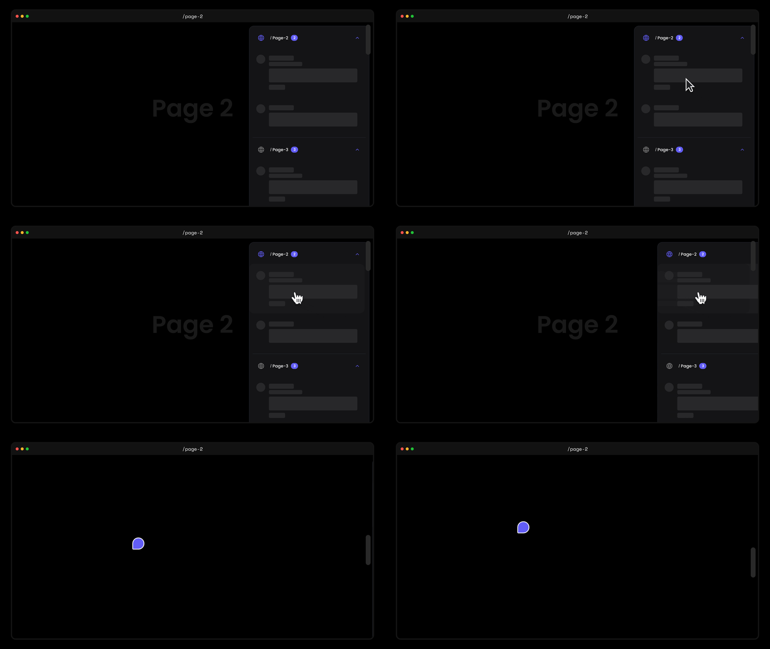
- This will scroll the page to the element directly. This will work if the element is present on the DOM.
- React / Next.js
- Other Frameworks
selectCommentByAnnotationId
- Use this to programmatically select a comment annotation by its ID.
- When called without arguments or with an invalid ID, it will close the currently selected annotation.
- Example: If the user opens a comment URL from an email notification, you can use this to open the comment dialog after your page has finished rendering.
- React / Next.js
- Other Frameworks
onCommentSelectionChange
- React / Next.js with Hooks
- React / Next.js
- Other Frameworks
The
useCommentSelectionChangeHandler hook can be used to subscribe to Comment selection changes.enablescrollToComment
Comment when it is clicked.
Default: true
By default, users will be redirected to a Comment if the comment id is provided in the url. But sometimes this experience is annoying, so we have provided a way to disable the option to automatically scroll users to the location of the Comment.
- React / Next.js
- Other Frameworks
To disable the feature, set
scrollToComment to false.- React / Next.js
- Other Frameworks
DOM Controls
allowedElementIds
allowedElementClassNames
allowedElementQuerySelectors
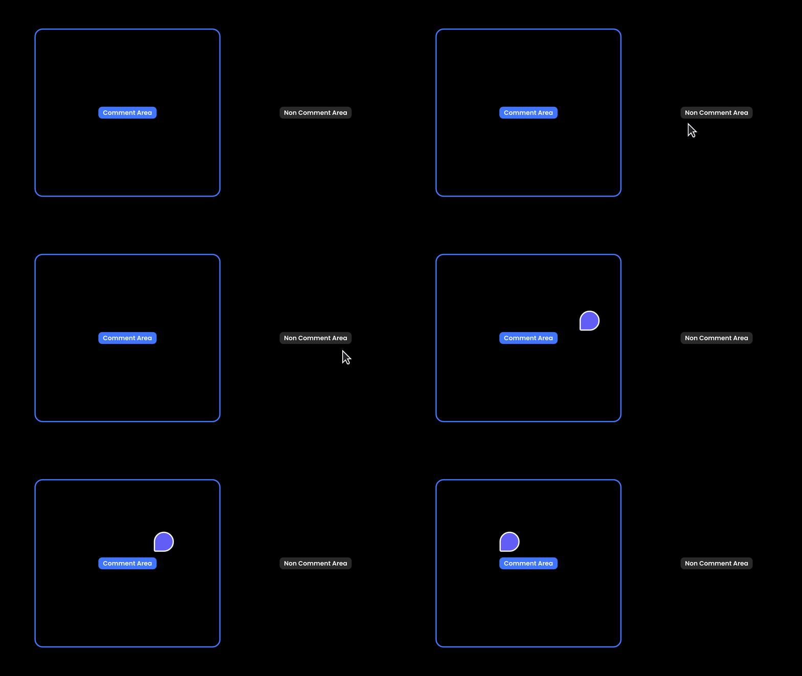
Popover mode.
- React / Next.js
- Other Frameworks
Using Props:Using API Method:
data-velt-comment-disabled
data-velt-comment-disabled attribute to elements where you want to disable commenting.
sourceId
- When you have multiple elements with the same DOM ID, you can use the
sourceIdattribute to control which element displays the comment dialog when adding a new comment. - By default, comments appear on all matching elements.
- This is useful in cases where you have multiple instances of the same data component on a page and want the comment to appear on each instance, such as Popover comments on a table.
- You can randomly generate the
sourceId. It just needs to be unique for each element in the current session.
- React / Next.js
- Other Frameworks
AI Categorization
enableAutoCategorize
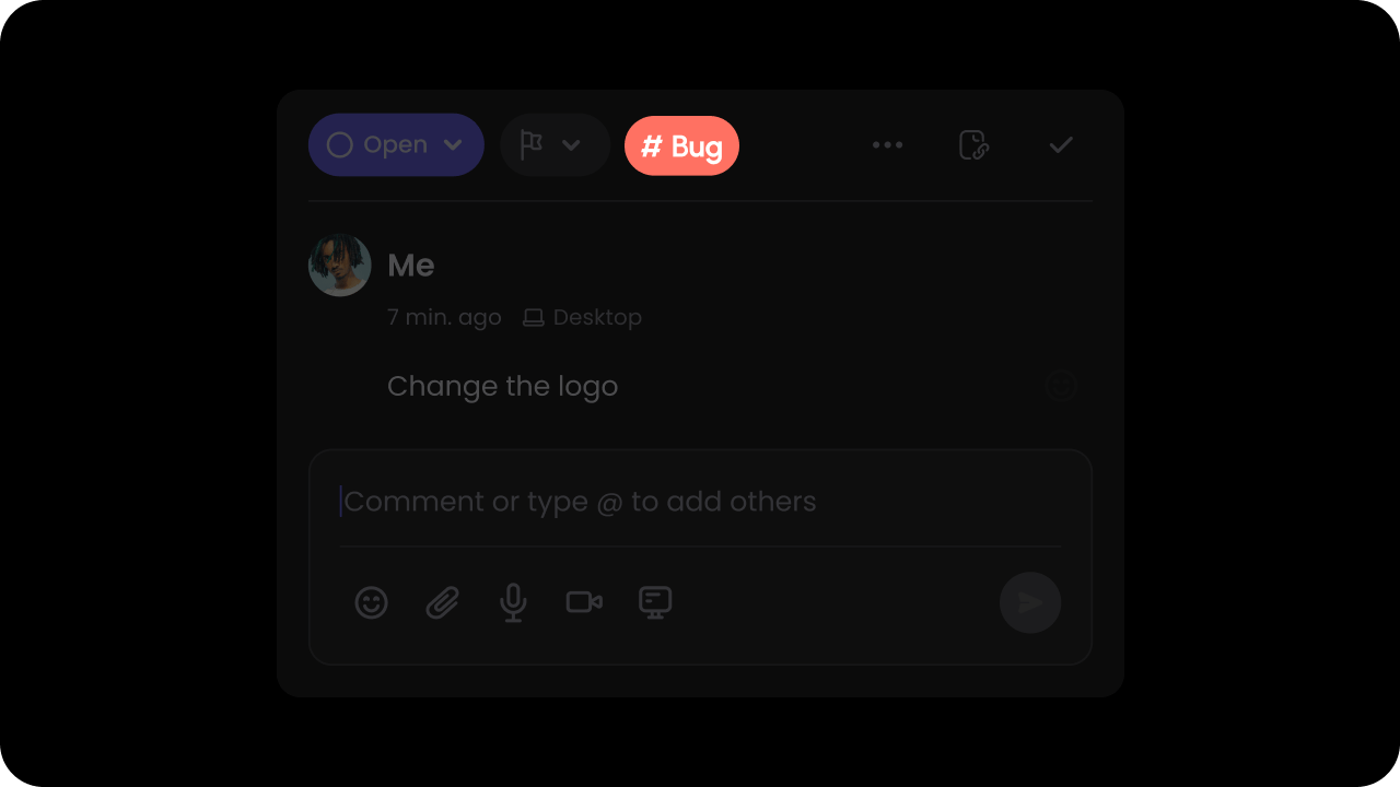
Default: false
We use AI to analyze your comment content and auto-categorize it so users can filter comments easily. You can provide a list of custom categories that we should use to categorize the comments (shown below).
- React / Next.js
- Other Frameworks
- React / Next.js
- Other Frameworks
setCustomCategory
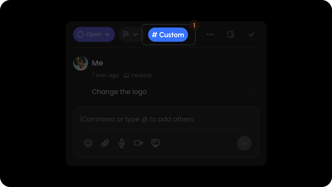
- React / Next.js
- Other Frameworks
Pass custom categories in the
customCategory prop.Default categories: Question, Feedback, Bug, Other.With custom categories, you can replace the default categories with your own values.These categories are used in the Comments Sidebar to filter comments by category. The AI autoCategorize feature uses the list of categories to determine the closest category to choose from.The input format to the customCategory prop should be an array of objects with an id, name, and color.The color property is used to set the category pill background color.- React / Next.js
- Other Frameworks
Agent Comments
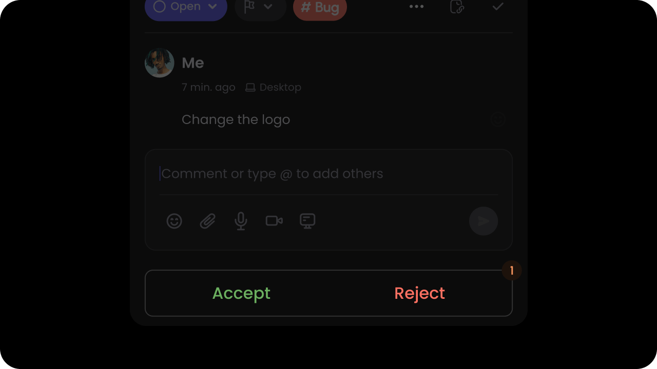
Agent comments let your AI agents leave comments and findings directly in Velt by calling the Comment Annotations REST APIs — no SDK changes required. They are built on top of the same Comments feature, but render with a special UI: each agent finding is a suggestion with Accept and Reject buttons on the comment dialog. For the full guide — theagent block, request/response shapes, and velt vs external agents — see Agent Comments.
Create an agent comment
Your agent calls the Add Comment Annotations API with anagent block attached to the root comment and type: "suggestion". The server stamps sourceType: "agent" on both the comment and the annotation.
cURL
agentId, executionId, agentSource, agentSuggestions, agentComments).
Handle accept / reject
Because agent findings render with Accept and Reject buttons on the comment dialog, the outcome is emitted on the comment element as thesuggestionAccepted and suggestionRejected events. Subscribe to them to apply the change to your own data or trigger follow-up logic.
- React / Next.js
- Other Frameworks
UI/UX
composerMode
By default, theComposer in the Comments Dialog only shows the text input box and does not show the actions bar until the Composer is clicked on or the user starts typing.
You can modify this behavior by setting the Composer Mode prop to "expanded". This will make the actions bar always visible.
To keep the default behavior you can set the property to "default".
Default: "default"
- React / Next.js
- Other Frameworks
commentToNearestAllowedElement
Attach comment pins to the closest allowed element when clicking on a non-allowed element. Default:false
- React / Next.js
- Other Frameworks
deleteThreadWithFirstComment
Whether deleting the first comment in a thread will delete the entire thread. Default:true
- React / Next.js
- Other Frameworks
draftMode
Whether to store comments in draft if they are not submitted. When enabled, partial comments are preserved when the dialog closes, including composer text, attachments, and recordings. Default:true
Behavior:
- Partial comments are saved with
isDraft: truewhen the dialog is closed - The dialog shows a shake animation on the first click outside if there’s unsaved content
- The
data-velt-annotation-draftattribute is set on dialogs with unsaved content for custom styling
- React / Next.js
- Other Frameworks
enableCollapsedComments
You can control whether comments inside the annotation should be collapsed.Default: false
- React / Next.js
- Other Frameworks
Using Props:Using API:
enableFullExpanded
- You can control whether comments should be shown in fully expanded state by default.
- Available on all comment-related components and can be controlled via props or API methods.
Default: false
- React / Next.js
- Other Frameworks
Using Props:Using API:
enableShortUserName
You can control whether long user names should be shortened. For long names, this will first create an initial of the second name and if the name is still long, it will truncate it with ellipses. Default:true
- React / Next.js
- Other Frameworks
Using Props:Using API:
enableSignInButton
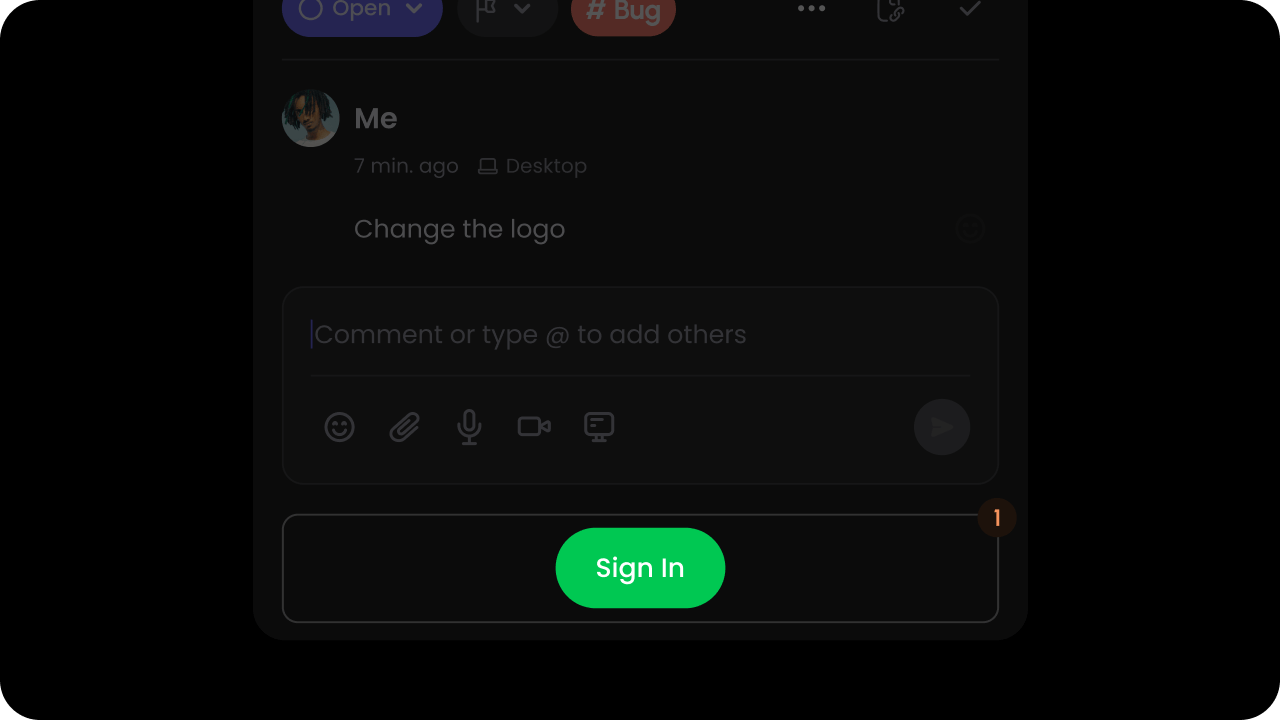
Default: false
This allows anonymous or signed out users to still read the comments but encourages them to sign in if they want to respond to the comments.
- React / Next.js
- Other Frameworks
- React / Next.js
- Other Frameworks
enableSidebarButtonOnCommentDialog
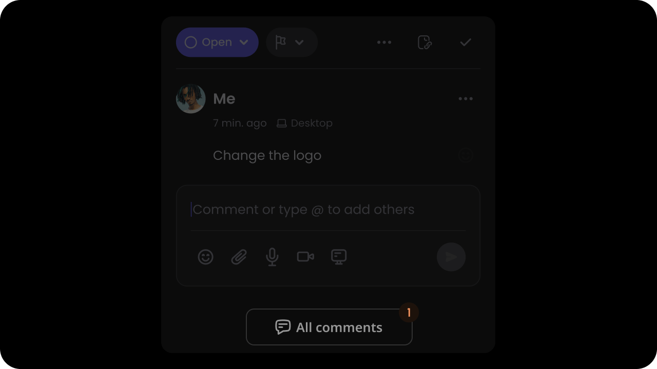
Default: true
By Default, each Comment Dialog has a button at the bottom that will open the Comments Sidebar when clicked.
To disable it, you can set it to false:
- React / Next.js
- Other Frameworks
Using Props:Using API methods:
enableDeleteReplyConfirmation
You can enable a confirmation dialog before deleting a reply in comment threads. This feature helps prevent accidental deletions and improves user experience.- React / Next.js
- Other Frameworks
Using Props:Using API:
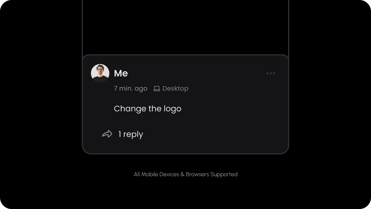
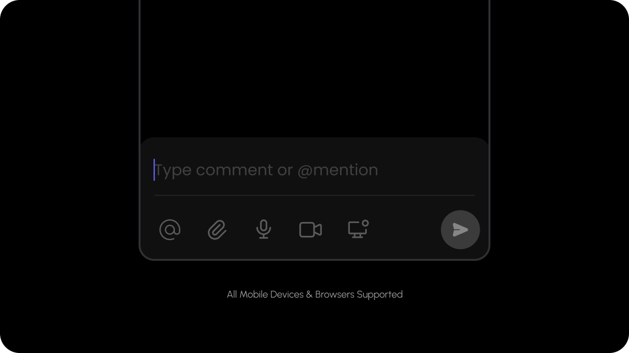
enableMobileMode
Default: false
- React / Next.js
- Other Frameworks
- React / Next.js
- Other Frameworks
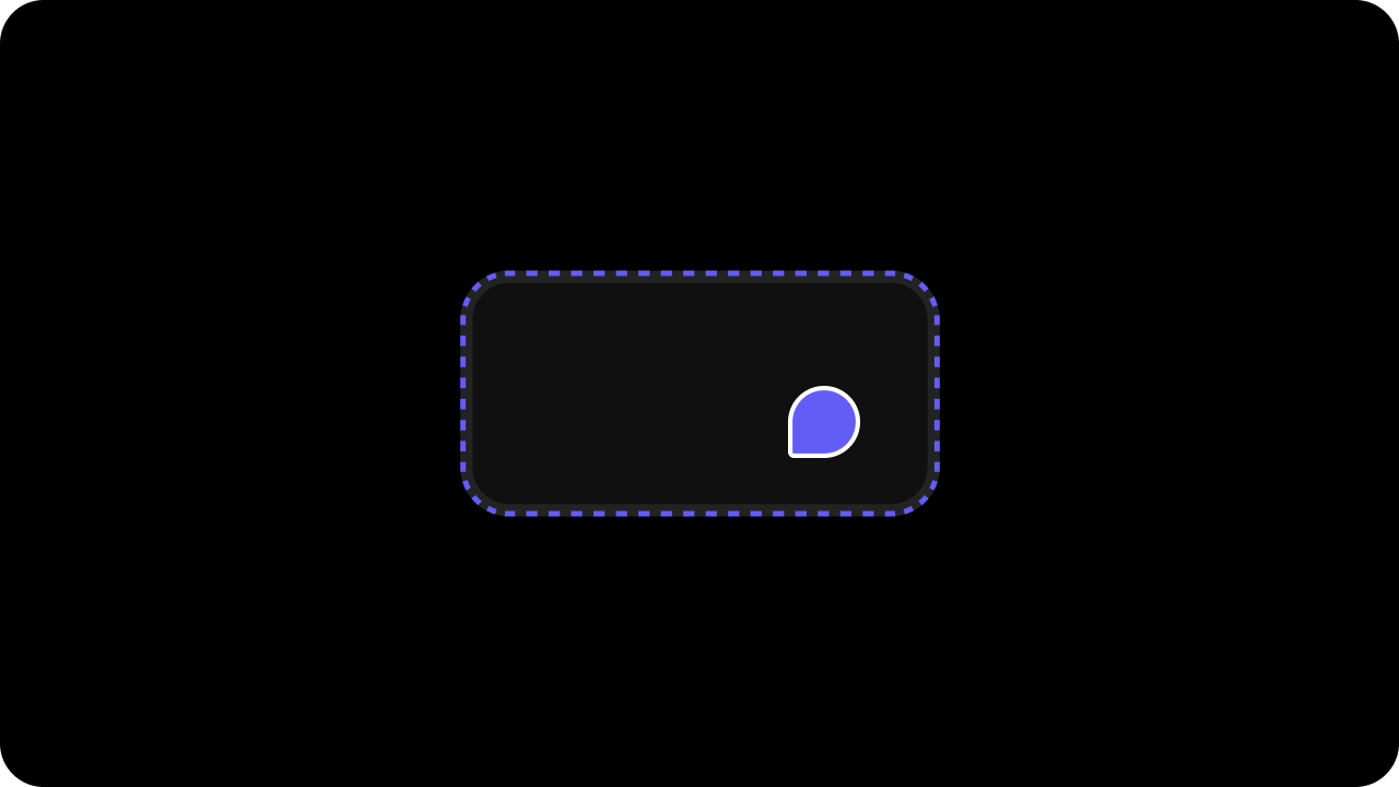
enableCommentPinHighlighter
Default: true
- React / Next.js
- Other Frameworks
- React / Next.js
- Other Frameworks
pinDrag
Whether comment pins can be dragged to reposition them.Default: true
- React / Next.js
- Other Frameworks
- React / Next.js
- Other Frameworks
enableDialogOnHover

Default: true
- React / Next.js
- Other Frameworks
- React / Next.js
- Other Frameworks
enableFloatingCommentDialog

Default: true
- React / Next.js
- Other Frameworks
- React / Next.js
- Other Frameworks
excludeLocationIds
Use this to filter out Comments at a specific Location for certain Users.- React / Next.js
- Other Frameworks
enableReplyAvatars
This shows the avatars of unique users who have replied to a comment.replyAvatars: Whether the reply avatar component is enabled.maxReplyAvatars: The maximum number of reply avatars to show. It will show the count of remaining unque users as the next avatar.
Default: false
- React / Next.js
- Other Frameworks
Using props:Using API:
filterCommentsOnDom
- Filter out comments in the DOM when they are filtered in the sidebar.
- When the sidebar is closed (default mode) or unmounted (embed mode), the DOM filter will be removed.
- Dual-gate behavior: When
setCommentSidebarData()is also active, this feature applies an AND — on-page pins must satisfy both the active sidebar filter criteria and the custom id list fromsetCommentSidebarData(). Drafts (isDraft: true) bypass both gates so an in-progress unposted comment is never filtered out from under the user.
Default: false
- React / Next.js
- Other Frameworks
Using Props:Using API:
focusPageModeComposer
Focus the page mode composer input field programmatically. Use this to direct user attention to the page mode composer. API Method:focusPageModeComposer()
- React / Next.js
- Other Frameworks
onSidebarButtonOnCommentDialogClick
Use this to act on clicks on the Sidebar Button at the bottom of the Comment Dialog.
- React / Next.js
- HTML
Using Props:Using Hooks:Using API methods:To unsubscribe from the subscription:
onSignIn
When the user clicks on the sign in button, we will emit anonSignIn event that you can handle with your own sign in method.
No data is passed with the event.
- React / Next.js
- Other Frameworks
showCommentsOnDom
Whether comments are shown on the DOM.Default: true
By default, all the comments will be visible on DOM whenever we are able to detect to elements for that. But users can hide it from DOM if required.
There are 2 ways to show/hide comments on DOM:
Configuring attributes on the React Component:
- React / Next.js
- Other Frameworks
- React / Next.js
- Other Frameworks
showResolvedCommentsOnDom
Whether to show resolved comments on the DOM.Default: false
- React / Next.js
- Other Frameworks
- React / Next.js
- Other Frameworks
updateCommentDialogPosition
- Sometimes when you manually set the position of the Comment Pin, the Comment Dialog might not position itself near the pin in certain scenarios like scrolling, zooming the page when the comment dialog is open.
- Use this to manually trigger an update. The dialog will reposition itself near the pin.
- React / Next.js
- Other Frameworks
Link Callback
Enable a callback when users click on links rendered in comment content. When enabled, links won’t automatically open; instead an event is emitted. How to use:- By default
linkCallbackisfalse. - When
false, clicking a link opens it directly and no callback is triggered. - When
true, clicking a link does not open it; instead alinkClickedevent is emitted so you can handle navigation.
- React / Next.js
- Other Frameworks
commentBubbleClicked
Listen to when a comment bubble is clicked. This event is triggered whenever a user clicks on a comment bubble. You can use this to implement custom actions like navigation or analytics tracking.- React / Next.js
- Other Frameworks
CommentBubbleClickedEvent
Extra Information
enableCommentIndex

Default: false
This appears in the comment sidebar and on the comment pins. When this is on, we show a small icon indicating the comment index in the order of creation date. This enables users to find and navigate to the desired comment quickly.
- React / Next.js
- Other Frameworks
- React / Next.js
- Other Frameworks
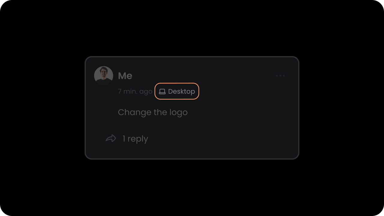
enableDeviceInfo
Default: false
When this is on, we show additional information in the Comment Thread indicating which device the comment was created on. This is useful especially for design tools, where additional context is needed for debugging issues.
- React / Next.js
- Other Frameworks
- React / Next.js
- Other Frameworks
enableDeviceIndicatorOnCommentPins

Comment Pins is enabled.
Default: false
When this is on, we show a small device type icon on the Comment Pin indicating which device the comment was created on. This is useful especially for design tools, where additional context is needed for debugging issues.
- React / Next.js
- Other Frameworks
- React / Next.js
- Other Frameworks
enableGhostComments

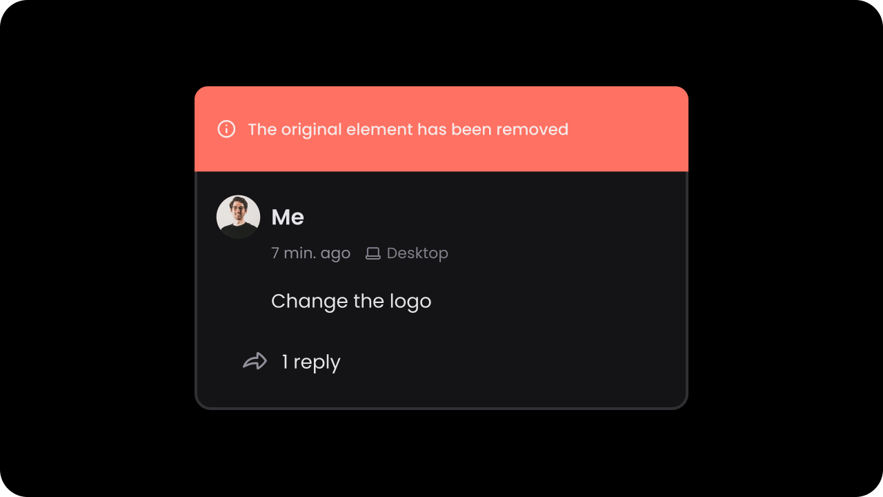
Default: false
Ghost comments are comments that were once linked to certain content on the DOM but that content is no longer available. If this is on, we display ghost comments in gray, close to where they were originally positioned on the DOM.
- React / Next.js
- Other Frameworks
enableGhostCommentsIndicator
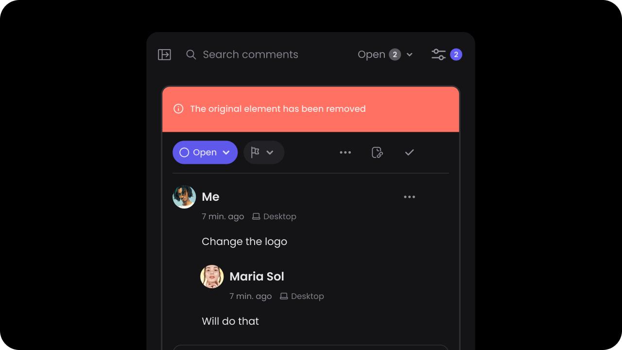
Default: true
Ghost comments are always shown in the comments sidebar so that users can see the history of all comments. If this is on, we show a label on the comment in the sidebar indicating that the original content on which this comment was added is no longer available. This sets better expectations with the users.
- React / Next.js
- Other Frameworks
Special File Type Support
Iframe Container Support
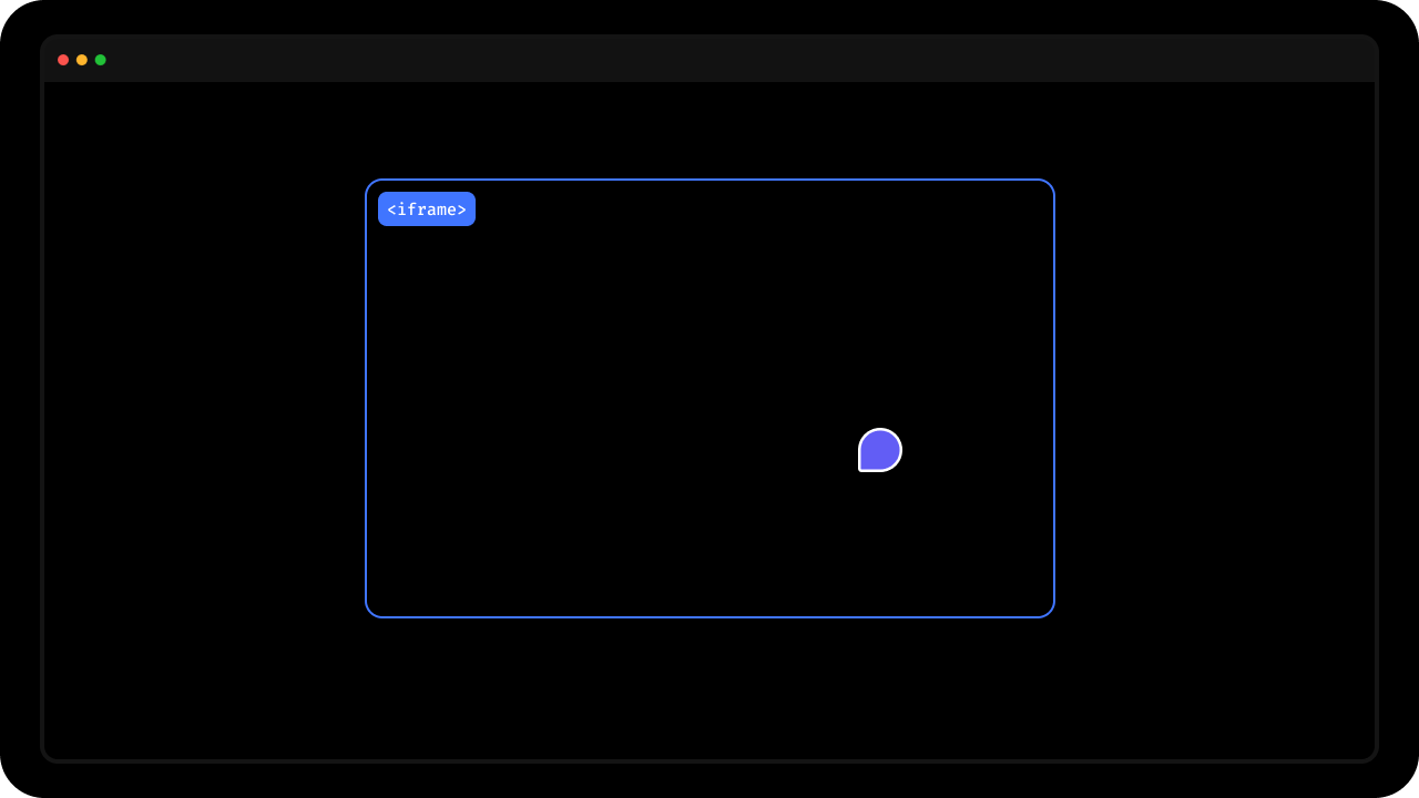
- To enable comments on an iframe, add
data-velt-iframe-container="true"to the iframe’s container element. - Note this will not insert the comments inside the contents of the iframe, but rather on top of the iframe.
data-velt-pdf-viewer
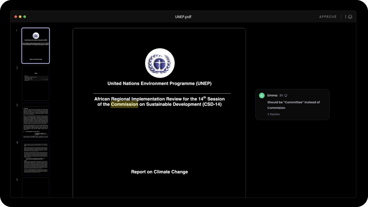
data-velt-pdf-viewer="true" attribute in the container element of the pdf viewer.
svgAsImg
- By default, Velt SDK treats SVGs as layered elements.
- If you want to treat SVGs as flat images, you can use this.
- Default:
false
- React / Next.js
- Other Frameworks
Using Props:Using API:
Keyboard Controls
enableHotkey
Whether Hotkeys are enabled or not. For now, the only hotkey supported is pressingc to enable comment mode.
Default: false
- React / Next.js
- Other Frameworks
Using Props:Using API Method:
enableEnterKeyToSubmit
- By default, pressing
enterwill add a new line and pressingshift+enterwill submit a comment. - You can change this default behavior so that pressing
enterwill submit a comment by setting theenterKeyToSubmitproperty totrue.
- React / Next.js
- Other Frameworks
Using Props:Using API Method:
enableDeleteOnBackspace
- Use this to enable or disable deleting comments when backpsace key is pressed.
enabled
- React / Next.js
- Other Frameworks
Using Props:Using API:
Moderation
enableModeratorMode
Default: false
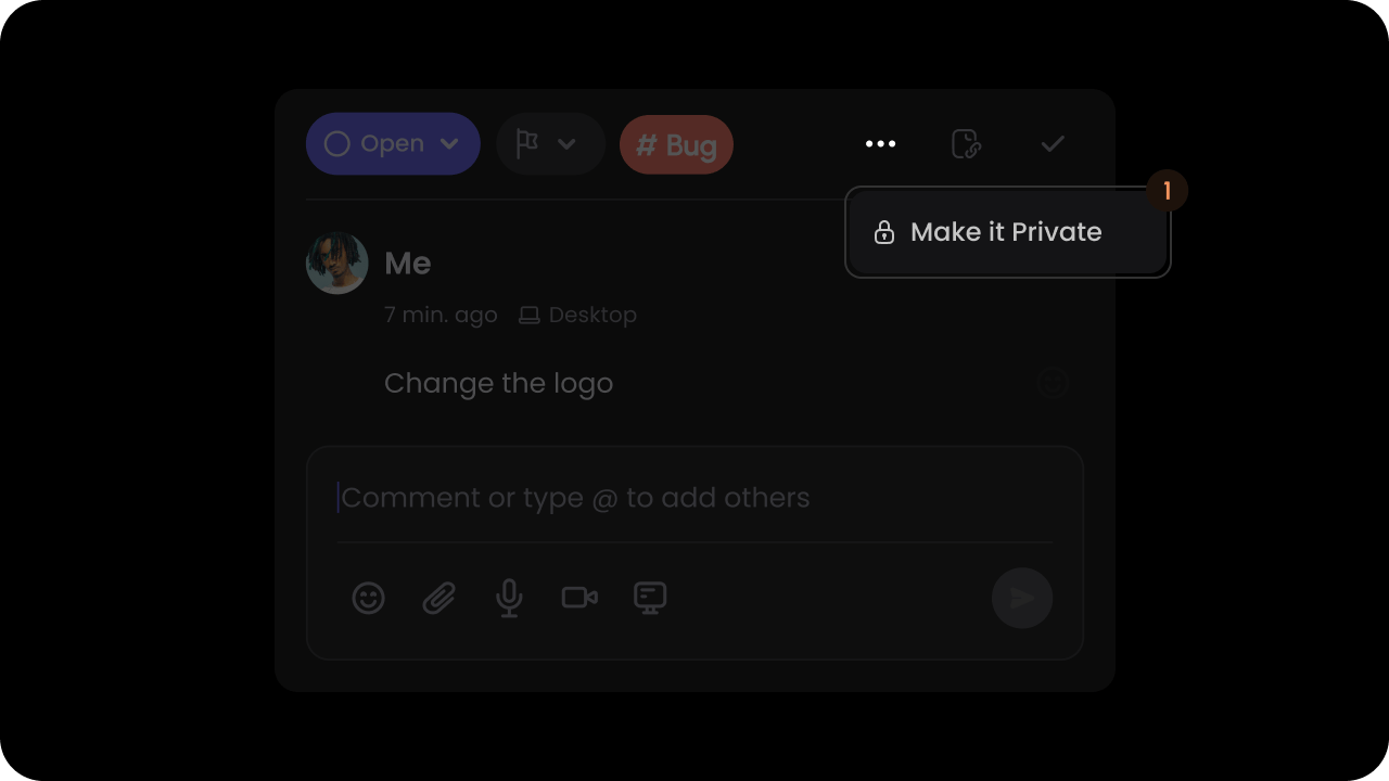
By default, when a user adds a comment it is visible to all authenticated users on the same document. Moderator mode makes visibility of all comments private to only admin users and the comment author. Admin users will see an approve button on the comment dialog. Once approved the comment will be visible to all users who can access the document.
You can set some users as admin by setting the isAdmin property in the User object, during the identify() call.
- React / Next.js
- Other Frameworks
- React / Next.js
- Other Frameworks
enableResolveStatusAccessAdminOnly
- Restrict the resolve action to admin users and the comment author only.
- React / Next.js
- Other Frameworks
Using Props:Using API:
approveCommentAnnotation
- Approves a comment annotation in moderator mode
- Params: ApproveCommentAnnotationRequest
- Returns: ApproveCommentAnnotationEvent
- React / Next.js
- Other Frameworks
acceptCommentAnnotation
- Accepts a comment annotation in suggestion mode
- Params: AcceptCommentAnnotationRequest
- Returns: AcceptCommentAnnotationEvent
- React / Next.js
- Other Frameworks
rejectCommentAnnotation
- Rejects a comment annotation in suggestion mode
- Params: RejectCommentAnnotationRequest
- Returns: RejectCommentAnnotationEvent
- React / Next.js
- Other Frameworks
enableSuggestionMode
Default: false
- React / Next.js
- Other Frameworks
To accept comments, set the
suggestionMode attribute to true.- React / Next.js
- Other Frameworks
enableReadOnly
Control whether comments are in read-only mode. When enabled, any features requiring user interaction (e.g., Composer, Reactions, Status) will be removed. Default:false
- React / Next.JS
- Other Frameworks
Using Props:Using API:
Comment Read Status
enableSeenByUsers
Control whether the “Seen By” feature is enabled for comments. When enabled, it shows which users have seen each comment. Default:true
- React / Next.js
- Other Frameworks
Using Props:Using API:
setUnreadIndicatorMode
Whetherverbose mode is enabled for unread Comments.
Default: 'minimal'
Unread Comments can be in minimal mode or verbose mode.
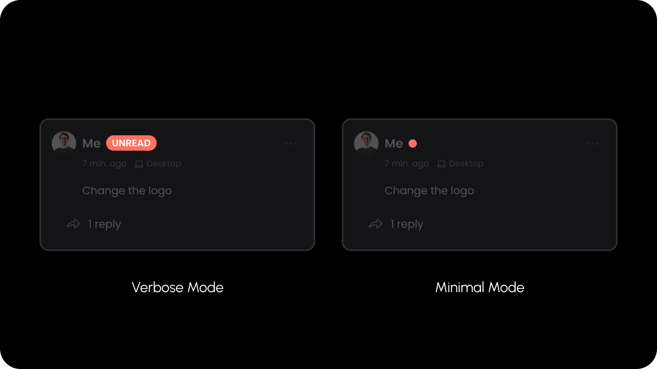
In minimal mode, a small red dot indicator appears for unread Comments.
In verbose mode, a larger badge with the text “UNREAD” will appear for unread Comments.
- React / Next.js
- Other Frameworks
- React / Next.js
- Other Frameworks
Toggle Comment Types
enableAreaComment
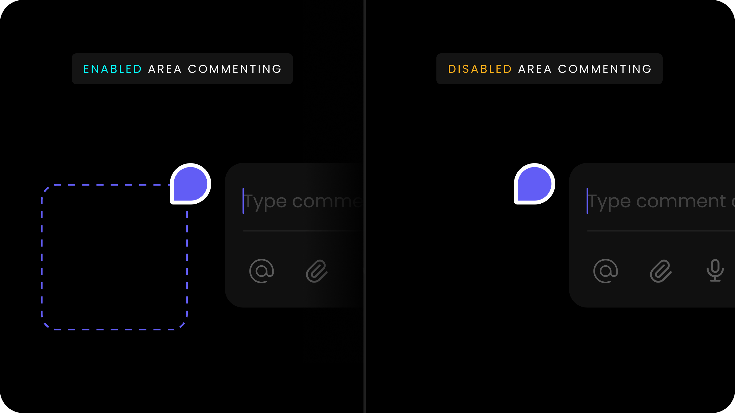
Area comments allows users to draw a rectangle and attach a comment to it. Use this to enable or disable area comments. Default:true
- React / Next.js
- Other Frameworks
Using Props:Using API Method:
enablePopoverMode
For a complete setup guide for Popover mode, read
here.
false
- React / Next.js
- Other Frameworks
enableStreamMode
For a complete setup guide for Stream mode, read
here.
false
- React / Next.js
- Other Frameworks
enableTextMode
For a complete setup guide for Text mode, read
here.
true

- React / Next.js
- Other Frameworks
Using Props:Using API:
enableInlineCommentMode
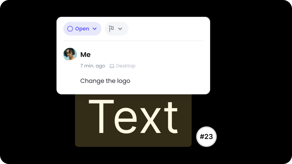
false
- React / Next.js
- Other Frameworks
enableMultithread
- By default comments are single threaded.
- You can make it multithreaded by setting
multiThreadprop totrue. - If you had previously used a wireframe for the comment dialog, you will need to add the multithread wireframe.
- Default:
false
- React / Next.js
- Other Frameworks
collapsedRepliesPreview
When enabled, a comment dialog’s non-selected preview state shows the collapsed thread teaser (first comment, a “Show N replies…” divider, and the last comment) instead of only the first comment. Clicking the divider selects and expands the dialog in one step. API Methods:enableCollapsedRepliesPreview(), disableCollapsedRepliesPreview()
- Params:
none - Returns:
void
false
This flag is also exposed as the
collapsedRepliesPreview wireframe variable (boolean, default false) on the comment dialog’s more reply slot.- React / Next.js
- Other Frameworks
Using Props:Using API:
Comment Tool
context
- Add
contextto theVelt Comment Toolcomponent to associate custom metadata with comments created using that tool. - Predefine context directly within the component itself.
- Currently, this feature is specific to popover comments. This allows you to, for example, assign unique context to each cell in a table if you place a
Velt Comment Toolin each cell. - The
contextprop accepts an object with key-value pairs.
- React / Next.js
- HTML
contextInPageModeComposer
Pass context data to the page mode composer when opening the comment sidebar via the comment tool. Context automatically clears when the sidebar closes. API Methods:enableContextInPageModeComposer(), disableContextInPageModeComposer()
- Params:
none - Returns:
void
For programmatically setting context data, see
setContextInPageModeComposer().- React / Next.js
- Other Frameworks
enableCommentMode
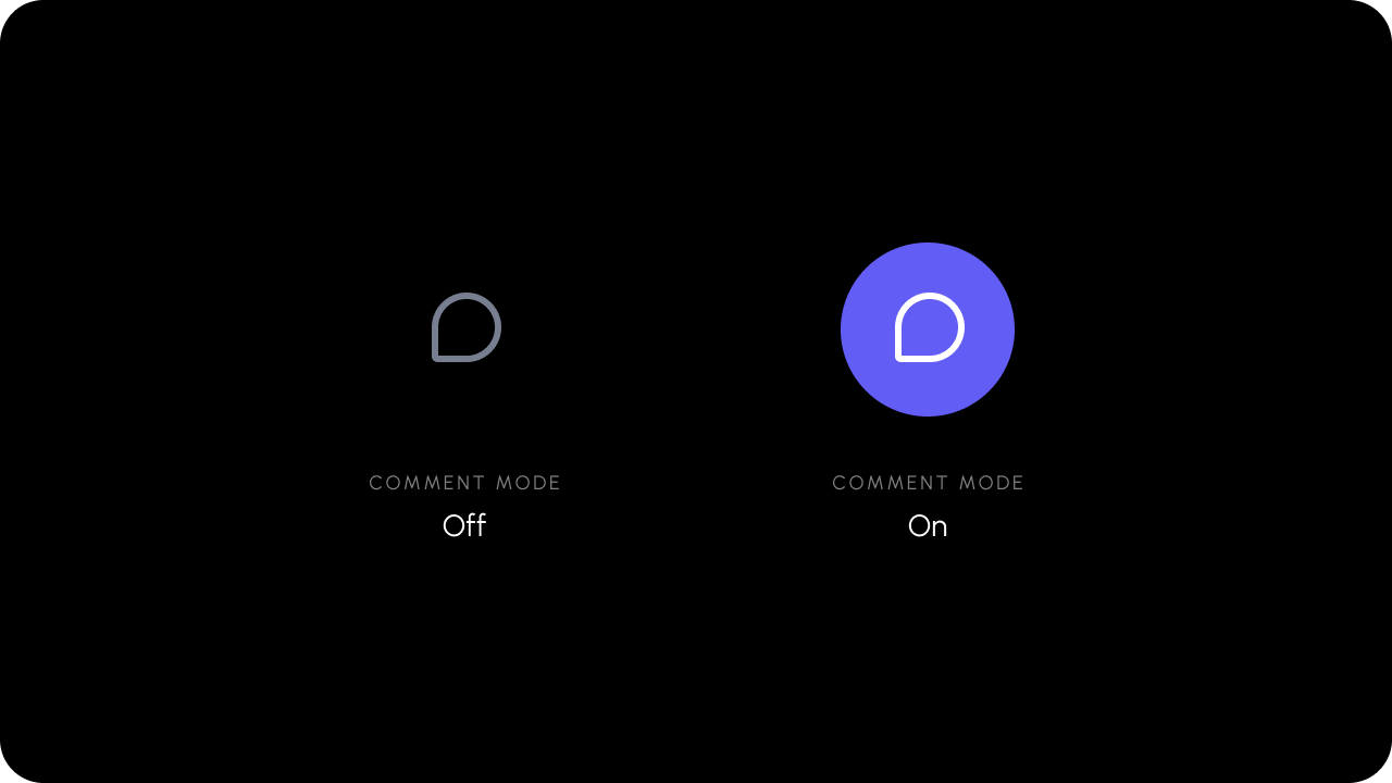
- React / Next.js
- Other Frameworks
onCommentModeChange

- React / Next.js with Hooks
- React / Next.js
- Other Frameworks
The
useCommentModeState() hook can be used to get the Comment mode without having to subscribe to changes. When the Comment mode changes, the hook return value will update.The subscription is automatically unsubscribed when the component dismounts.enableCommentTool

Default: true
When the Comment Tool is disabled, it can not be used to leave comments. Other ways to leave comments, such as highlighting text, will also be disabled.
- React / Next.js
- Other Frameworks
Using Props:Using API methods:
disabled
Disables the comment tool and prevents users from adding new comments. This is helpful when you want to temporarily or conditionally restrict comment creation while still allowing users to view existing comments. Default:false
This prop disables the specific comment tool instance it is applied to; the
disableCommentTool() API disables all comment tools globally.- React / Next.js
- Other Frameworks
enableChangeDetectionInCommentMode
- By default, DOM Change Detection is disabled in Comment Mode for better performance.
- You can enable it to automatically reposition comment pins when the DOM changes while in Comment Mode.
Default: false
- React / Next.js
- Other Frameworks
Using Props:Using API Method:
enablePersistentCommentMode
- When Persistent comment mode is enabled, you can continue leave additional comments after finishing a comment.
- When it is disabled, you will need to reclick the Comment Tool every time when you want to make a comment.
false
- React / Next.js
- Other Frameworks
forceCloseAllOnEsc
- When enabled, pressing the ESC key will force close persistent comment mode even if a comment thread is currently active.
- When disabled (default), pressing ESC will only close the active comment thread but keep persistent comment mode enabled.
- This provides more control over the ESC key behavior in persistent comment mode.
false
- React / Next.js
- Other Frameworks
setPinCursorImage
You can set custom mouse cursor when the comment mode is on. The custom cursor image must be 32 x 32 pixels.- React / Next.js
- Other Frameworks
- React / Next.js
- Other Frameworks
Minimap
enableMinimap
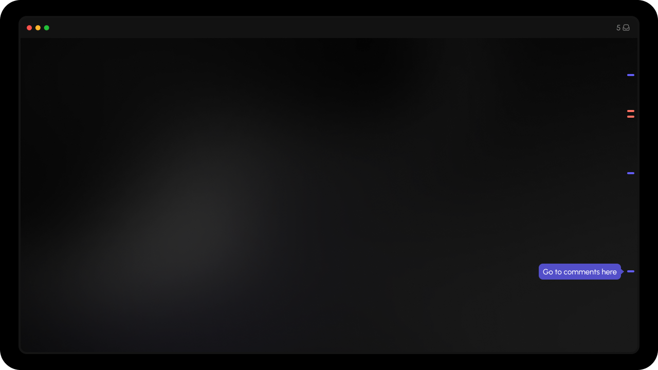
- The minimap shows a bar on the edge of the screen with indicators that show where comments exist.
- Use this to enable/disable the minimap. By default it’s disabled.
- It can be positioned
leftorright. By default, it’s positioned on the right side of the screen.
- React / Next.js
- Other Frameworks
- React / Next.js
- Other Frameworks
Inline Comments Section
sortBy and sortOrder
- Change the default sorting order of Comments in the Inline Comments Section.
-
Params:
sortBy: The field to sort by. Currently supportscreatedAtandlastUpdated. Default:lastUpdatedfor multithread andcreatedAtfor single thread.sortOrder: The order to sort by. It can beascordesc. Default:descfor multithread andascfor single thread.
- React / Next.js
- Other Frameworks
multiThread
- By default inline comment section is multithreaded.
- You can make it single threaded by setting
multiThreadprop tofalse. - Default:
true
- React / Next.js
- Other Frameworks
commentPlaceholder, replyPlaceholder, composerPlaceholder
- Customize placeholder text for different input fields in the inline comments section.
- Props:
commentPlaceholder: Placeholder text for the main comment input field.replyPlaceholder: Placeholder text for the reply input field.composerPlaceholder: Placeholder text for the composer input field.
- React / Next.js
- Other Frameworks
editPlaceholder, editCommentPlaceholder, and editReplyPlaceholder. See VeltInlineCommentsSectionProps for details.
composerPosition
- Change the position of the comment composer in the inline comments section to
toporbottom. - Default:
bottom
- React / Next.js
- Other Frameworks
context
- Pass a custom context object to the Inline Comments Section component.
- The provided context will be added to any comments created in the inline comments section, allowing you to associate custom metadata with those comments.
- Additionally, the component will filter and display only the comments that match the provided context object.
- This dual behavior makes it easy to scope comments to specific areas of your application (e.g., specific cells in a table, dashboard widgets, or data segments).
- React / Next.js
- Other Frameworks
contextOptions
- Configure the matching behavior for the context object when filtering comments.
- By default, comments must fully match all key-value pairs in the provided context.
- Set
partialMatch: trueto enable flexible matching where comments match if they contain all the specified context fields (extra fields in the comment’s context are ignored). - See
ContextMatching for detailed explanation and examples.
- React / Next.js
- Other Frameworks
readOnly
Control read-only mode at the component level. When enabled, users can view comments but cannot reply, edit, or add new comments in the Inline Comments Section. The local component prop takes precedence over global settings when explicitly set. Default:false
- React / Next.js
- Other Frameworks
Popover Comments
enableDialogOnTargetElementClick

Default: true
- React / Next.js
- Other Frameworks
- React / Next.js
- Other Frameworks
enablePopoverTriangleComponent
Whether the popover triangle appears when Popover Mode is enabled.Default: true
- React / Next.js
- Other Frameworks
- React / Next.js
- Other Frameworks
Comment Bubble
annotationId
- The id of the comment annotation to show the comment bubble on.
- The bubble will be rendered only if there is a comment annotation that matches the provided
annotationIdin the current document.
- React / Next.js
- Other Frameworks
targetElementId
- The DOM ID of the element where comment bubble is added.
- This binds the comment bubble to the element with the provided ID.
- The bubble will be rendered only if there is a comment annotation that was added to the element with the provided ID.
- React / Next.js
- Other Frameworks
context
- The
contextobject to filter which comment annotations to show the comment bubble for. - The bubble will be rendered only if there is a comment annotation that matches the provided
contextin the current document. - Works only with
popovermode comments. - Perfect for complex tables with filtering and segmentation needs.
- Set flexible comment anchoring and filtering logic at the cell level using key-value pairs.
- Supports aggregate views: Eg: comments added in day view can appear in week/month views automatically.
- Context commonly has combined use with context options and the group matched comments feature.
- React / Next.js
- Other Frameworks
contextOptions
- Matching behavior for the context object (default: full match, or set
partialMatch: truefor flexible matching). - How Partial Match Works:
- A comment will match if ALL provided filter criteria exist in the comment’s context
- Extra fields in the comment’s context don’t prevent matching
- Missing fields in the comment’s context prevent matching
- Example: Comment has
{ day: "01", week: "01", month: "jan", product: "cheese", location: "zurich" }- Filter
{ day: "01", product: "cheese" }→ ✅ matches (both fields exist in comment) - Filter
{ day: "01", category: "dairy" }→ ❌ no match (category doesn’t exist in comment)
- Filter
- Partial Match Examples:
- Comment has
{ day: "01", week: "01", month: "jan", product: "cheese" } - Filter with
{ day: "01", week: "01", month: "jan", product: "cheese" }→ matches (full) - Filter with
{ week: "01", month: "jan", product: "cheese" }→ matches (partial) - Filter with
{ day: "01", week: "01", month: "jan", product: "cheese", location: "zurich" }→ no match
- Comment has
groupMatchedComments
Whether to group multiple comment annotations in Comment Bubble component when multiple annotations match the providedcontext or targetElementId.
Default: false
- React / Next.js
- Other Frameworks
Using Props:Using API:
commentCountType
Whether to show unread or total comment replies count on Comment Bubble Component. Type:CommentCountType
total: Shows the total number of replies. (default)unread: Shows the number of unread replies.
- React / Next.js
- Other Frameworks
openDialog
Control whether the comment dialog opens when clicking on the comment bubble. When disabled, clicking the bubble will not open the comment dialog. This is useful when you want to handle bubble clicks with custom logic using thecommentBubbleClicked event.
Default: true
- React / Next.js
- Other Frameworks
readOnly
ThereadOnly flag prevents users from replying or editing existing comments in the target bubble while still displaying them.
This is useful when you want to display comments in a read-only mode where users can view but not modify or respond to comments.
Default: false
- React / Next.js
- Other Frameworks
Video Timeline Comments
setTotalMediaLength
Set the total length of media (in frames or seconds) for the timeline.- React / Next.js
- Other Frameworks
Using Props:Using API Method:
offset
- Allows comment bubbles to be positioned relative to both parent and child video clips by specifying an offset value.
- Default:
0
- React / Next.js
- Other Frameworks
Comment Pin
enableBubbleOnPin
Show a Comment Bubble when user hovers or clicks on the Comment Pin vs showing the Comment Dialog. The comment dialog will open only on clicking the comment bubble.Default: 'false'
- React / Next.js with Hooks
- React / Next.js
- Other Frameworks
Using Props:Using API Method:
enableBubbleOnPinHover
Show a Comment Bubble when user hovers on the Comment Pin vs clicks on it.Default: 'true'
- React / Next.js with Hooks
- React / Next.js
- Other Frameworks
Using Props:Using API Method:
Legacy Methods
onCommentAdd
- React / Next.js
- Other Frameworks
Using Props:Using Hooks:Using API:
onCommentUpdate
- React / Next.js
- Other Frameworks
Using Props:Using Hooks:Using API:
getAllCommentAnnotations
- Get all comment annotations for a given document and location.
- By default, it will return data for the current
documentIdandlocation. - Params (optional):
documentId: string; it will return all comments in the givendocumentId.location: Object; it will return all comments in the givenlocation.
- React / Next.js
- Other Frameworks
Using Hooks:Using API:To unsubscribe from the subscription: